Sunrise is the sixth-largest senior living provider in the U.S., operating more than 240 independent living communities throughout the country. For this project, the task was to create a distinct employer brand that effectively expresses the organization’s employer value proposition (EVP) to attract high-quality talent to support their diverse living communities.
TL;DR | Project Summary
The process began by analyzing the creative brief to define key parameters for the concept’s look and feel. As the design lead on this project, I researched target candidates, identified Sunrise’s differentiators, and explored how to highlight these unique attributes effectively.
I developed a concept that blended the organization’s main and internal brands, creating a unified employer brand symbol. This approach captured the essence of the Sunrise employment experience in a fresh, aspirational way. The client was pleased with the holistic integration and reported increased candidate engagement and a higher volume of qualified applicants.
Part I – Concept
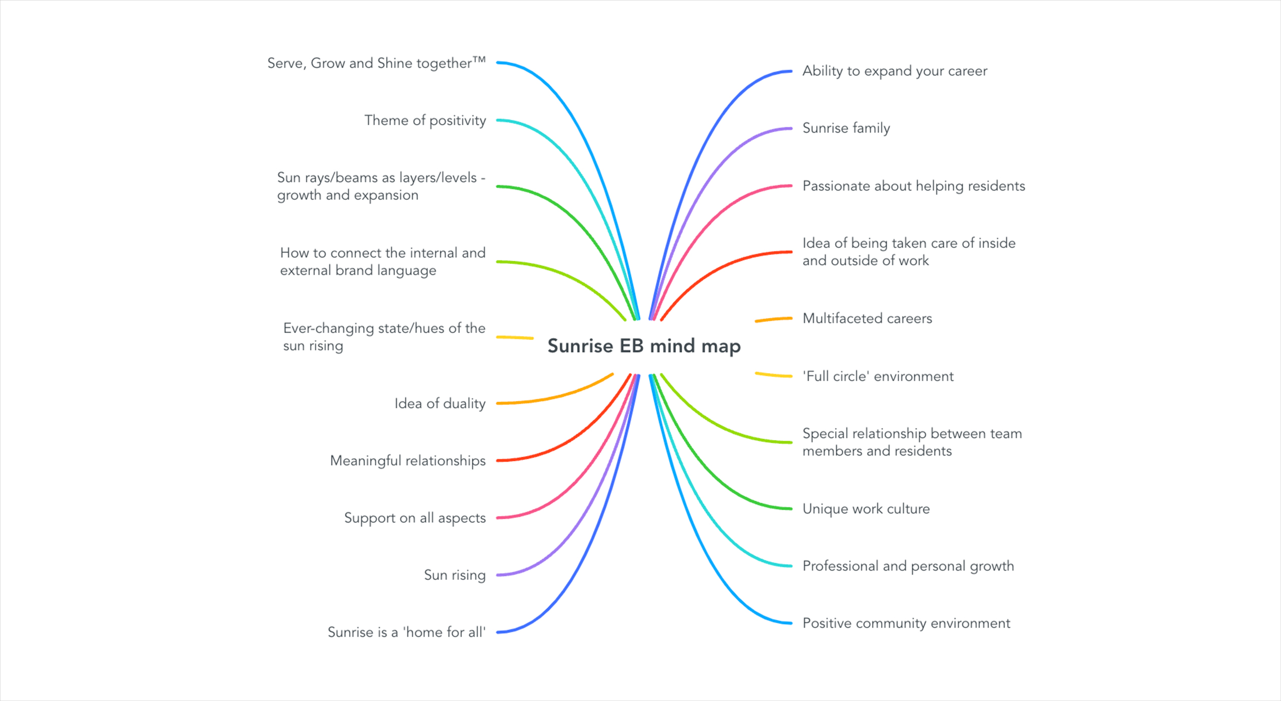
The creative process behind the employer branding for Sunrise started with a deep understanding of the organization and its unique appeal to candidates. The goal was to emphasize that Sunrise is more than just a place to work – it’s a place where employees grow professionally and personally while making a meaningful impact on residents’ lives. One of the initial courses of action for this process was brainstorming on key ideas that bubbled up from qualitative and quantitative research about the company’s differentiators. My team and I then created a mind map to jot down all the ideas and common subjects that we identified.
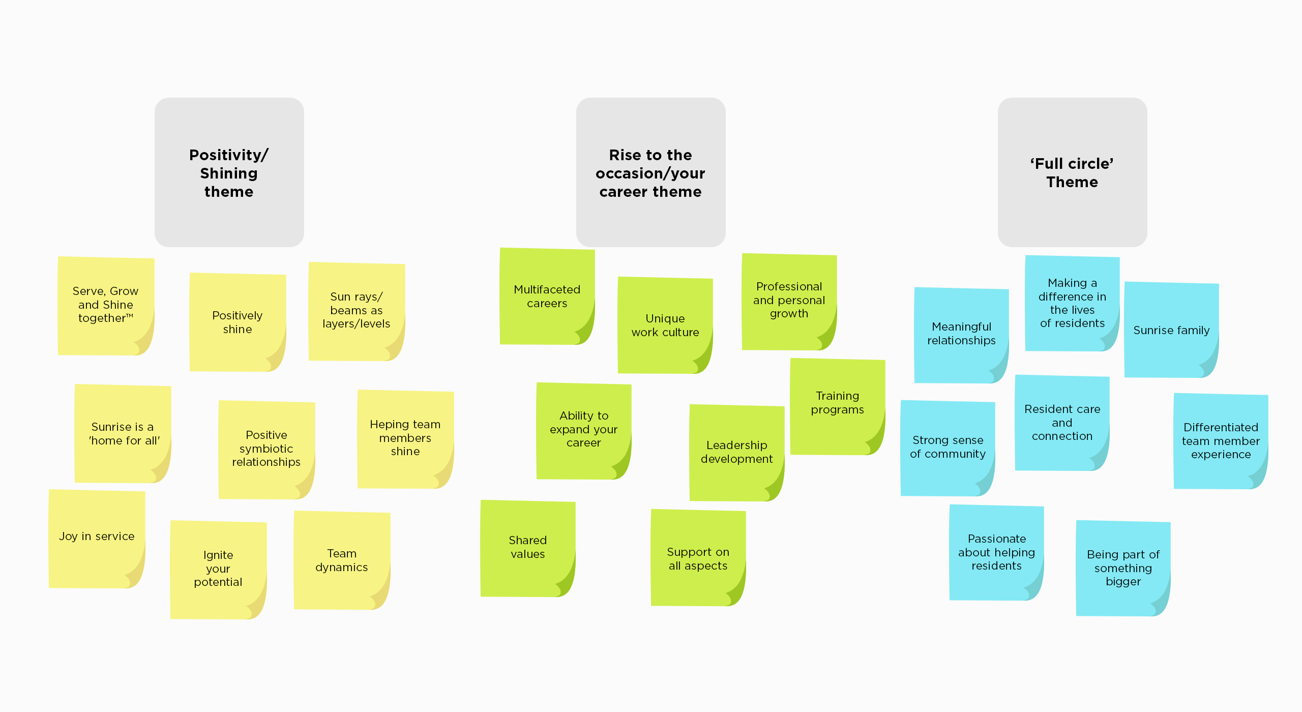
Next, we synthesized the information and ideas we had and bucketed them into three key themes. The themes that were uncovered all had a direct tie to the EVP research and it was a matter of identifying which theme fell in line with the employer branding narrative and story we are trying to tell. Eventually we landed on combining the ‘positivity’ and ‘rise to the occasion’ theme as one, making it the basis of our concept and anthemic voice and tone.
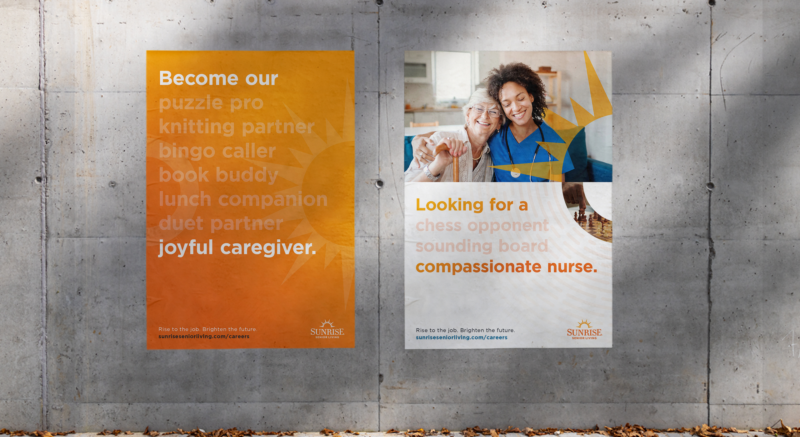
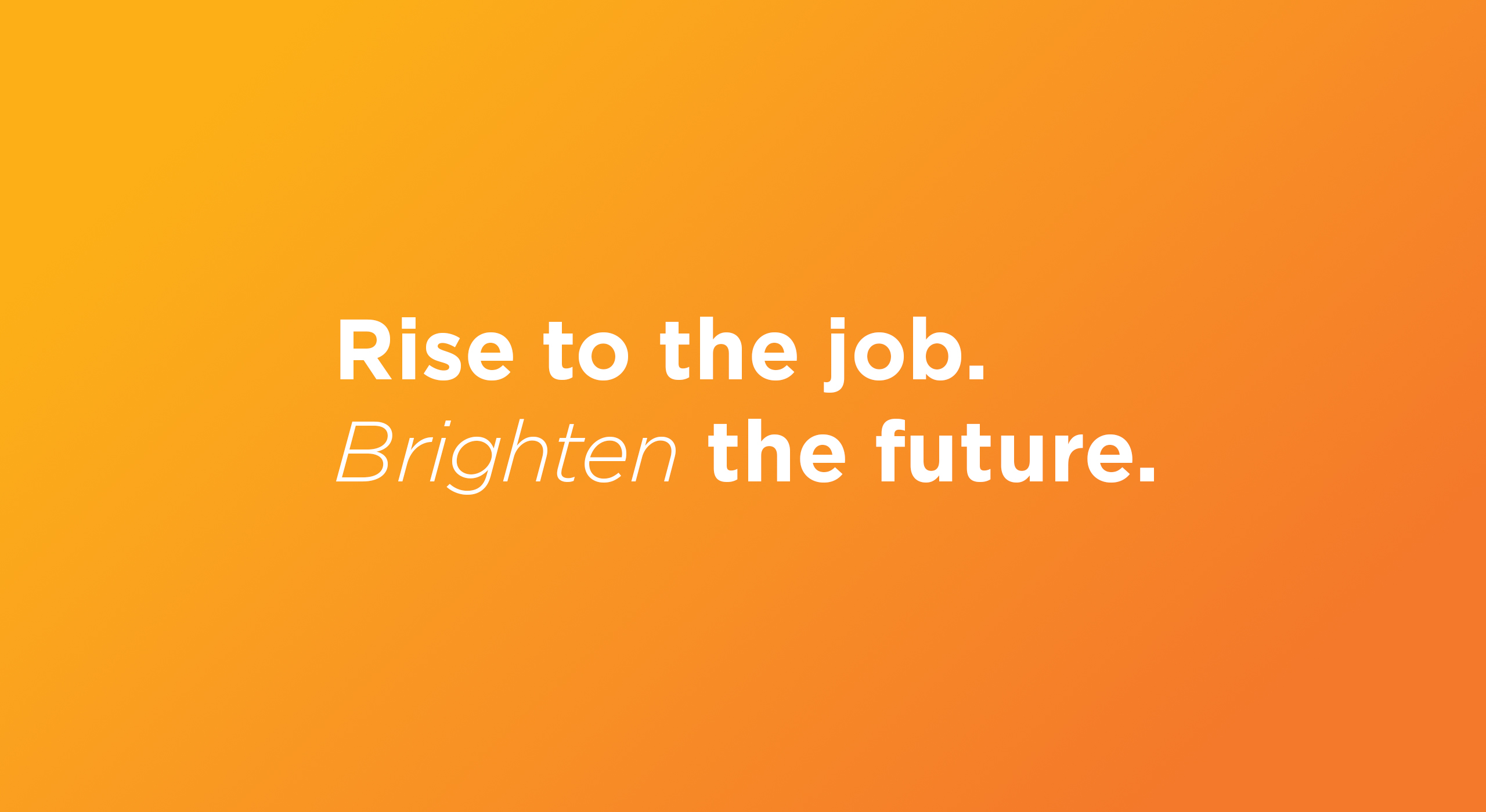
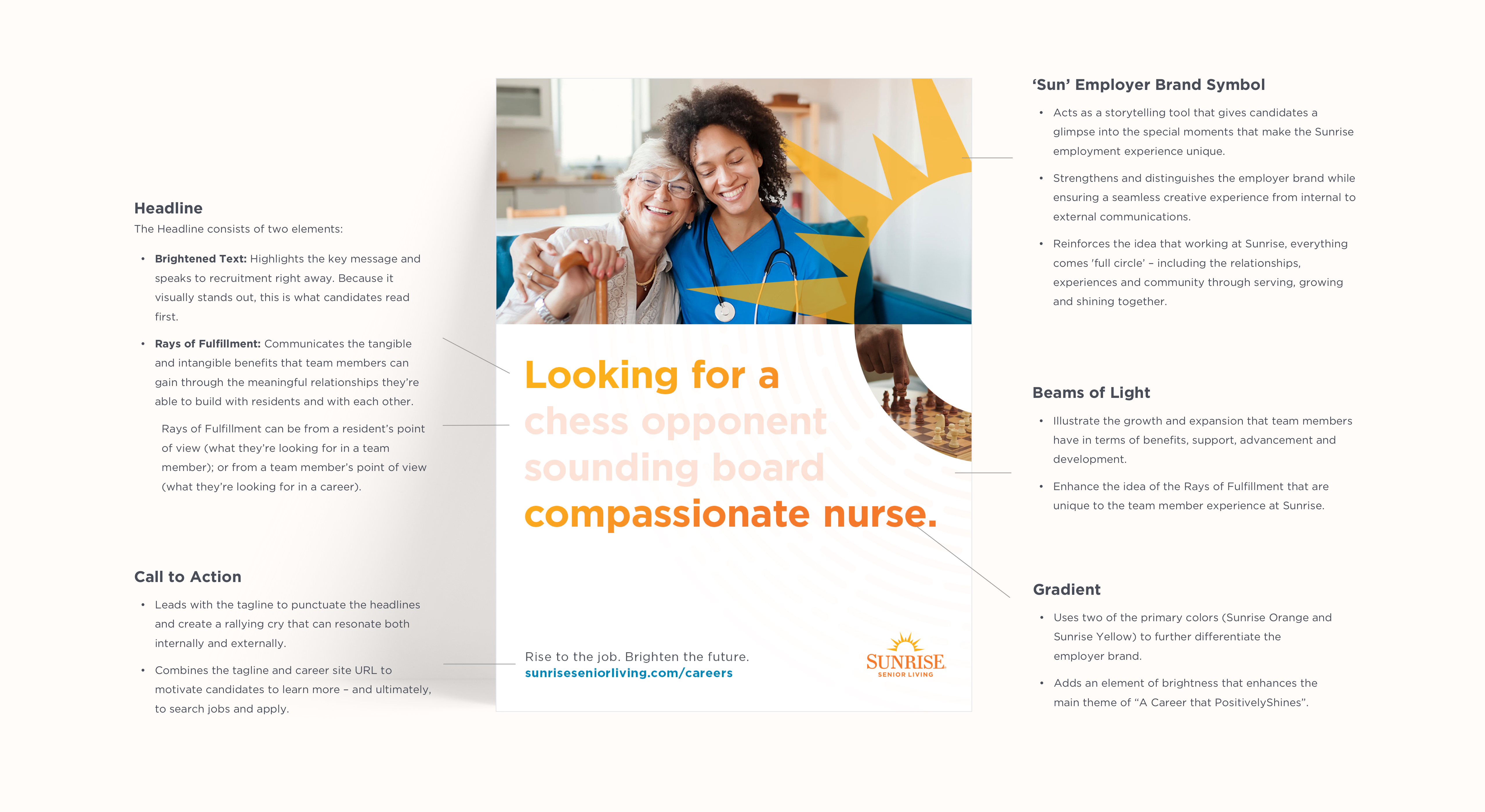
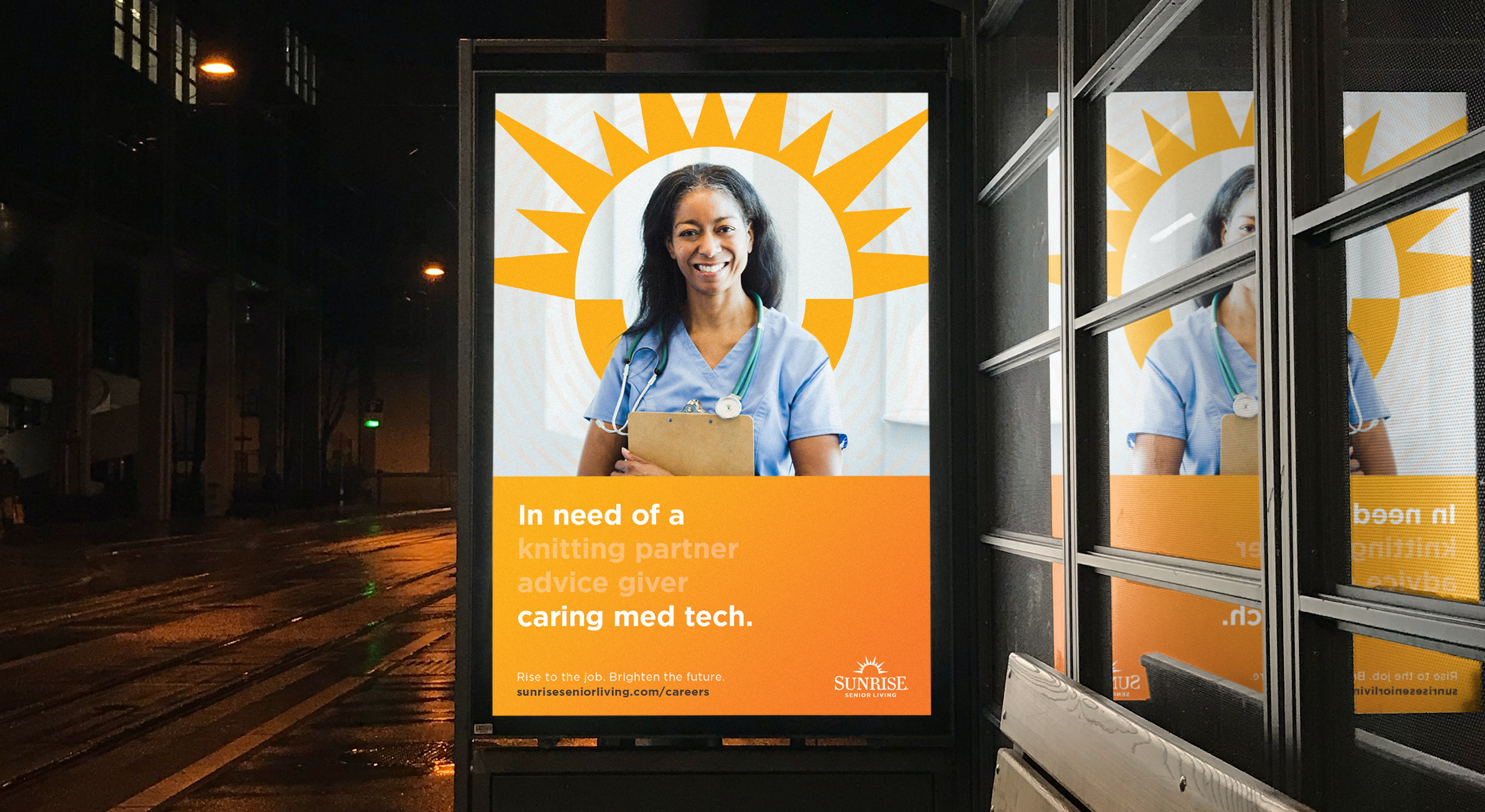
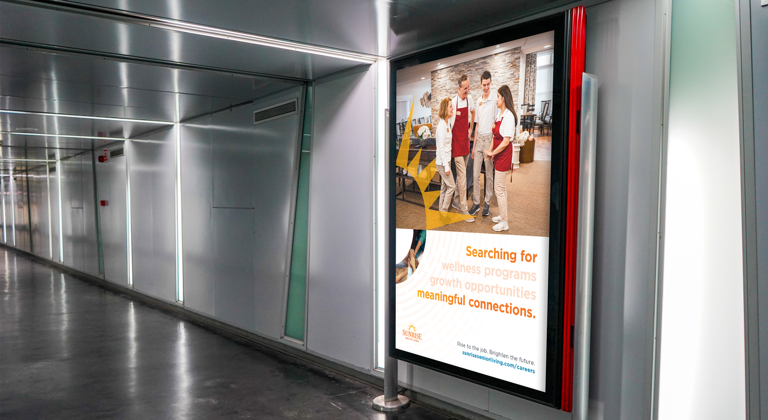
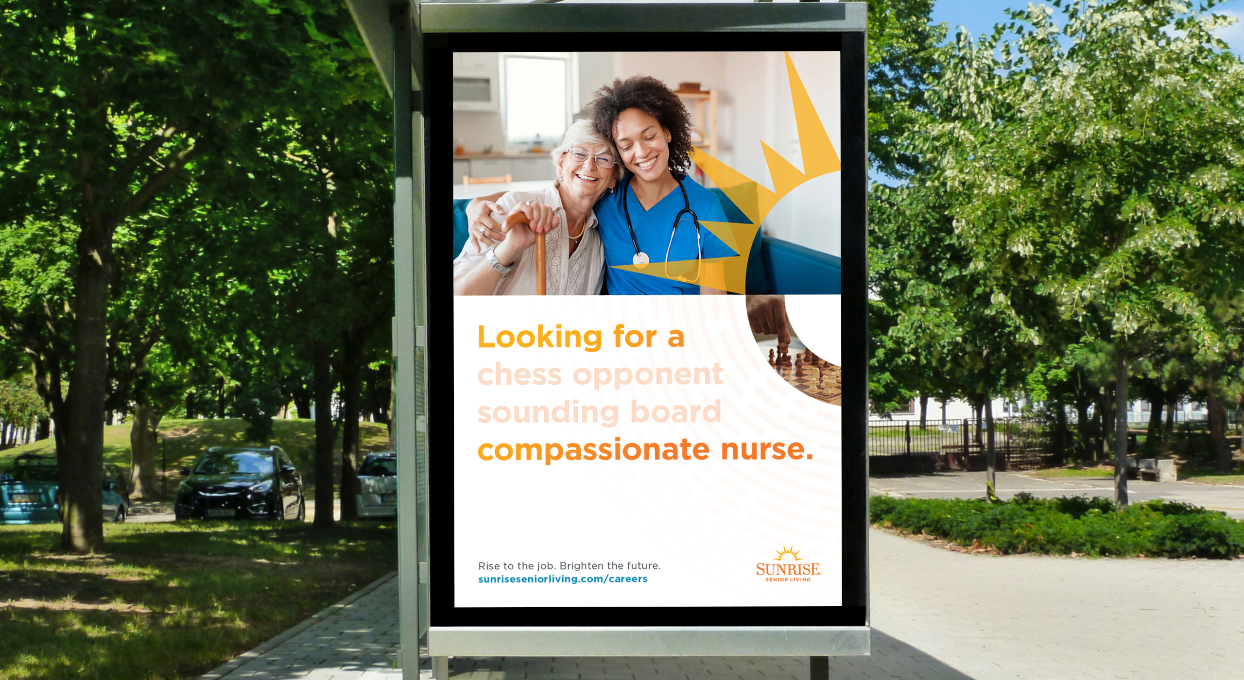
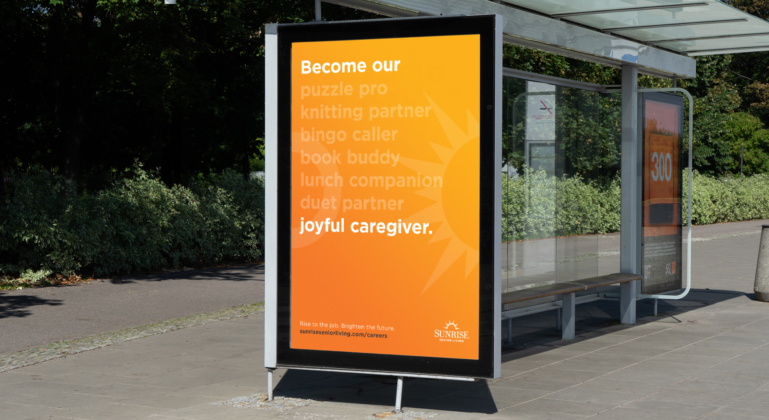
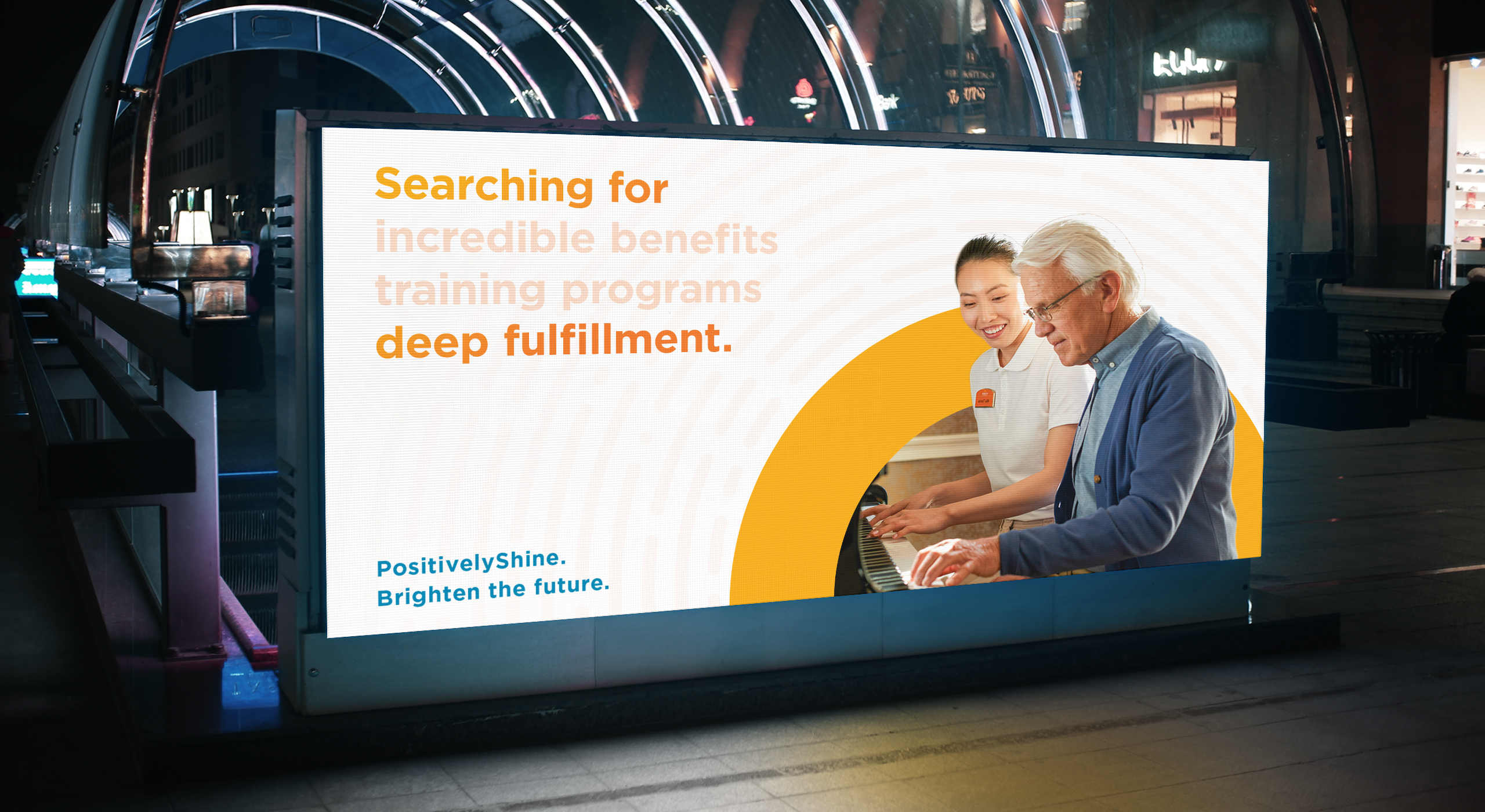
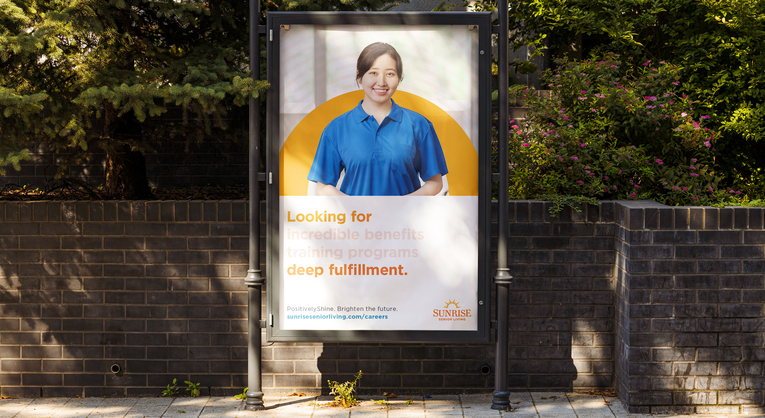
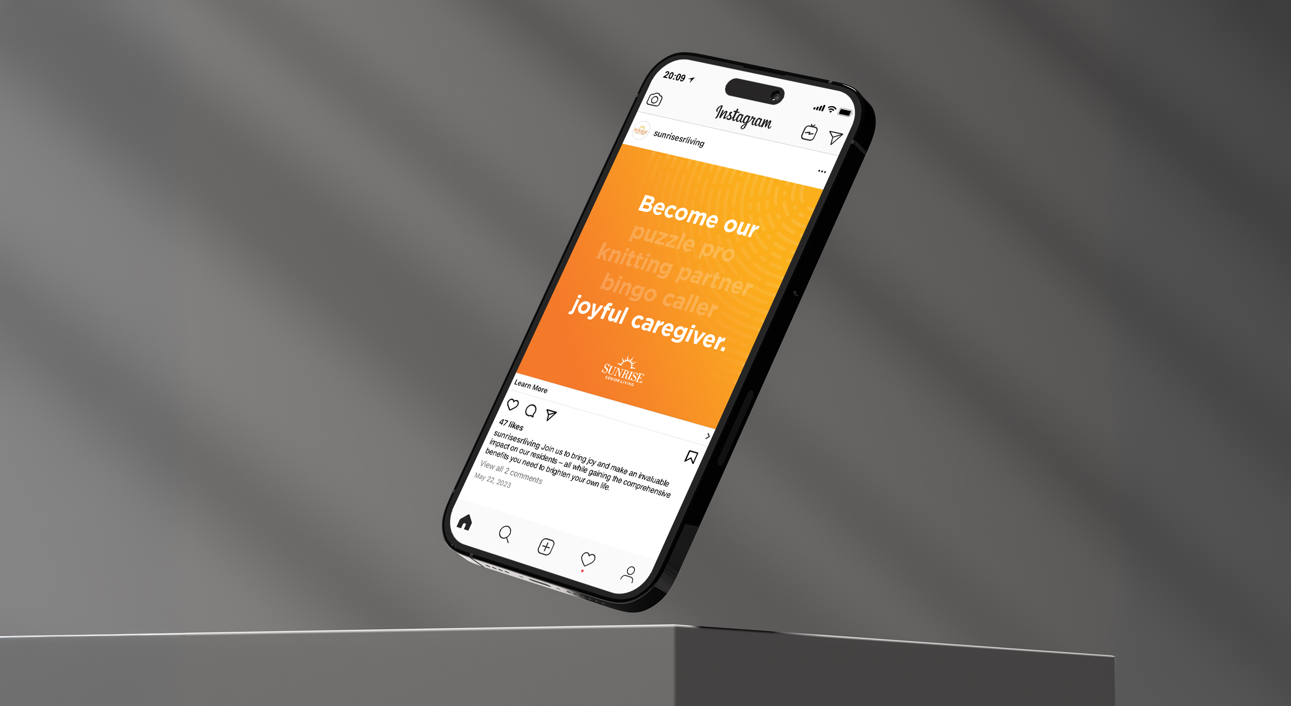
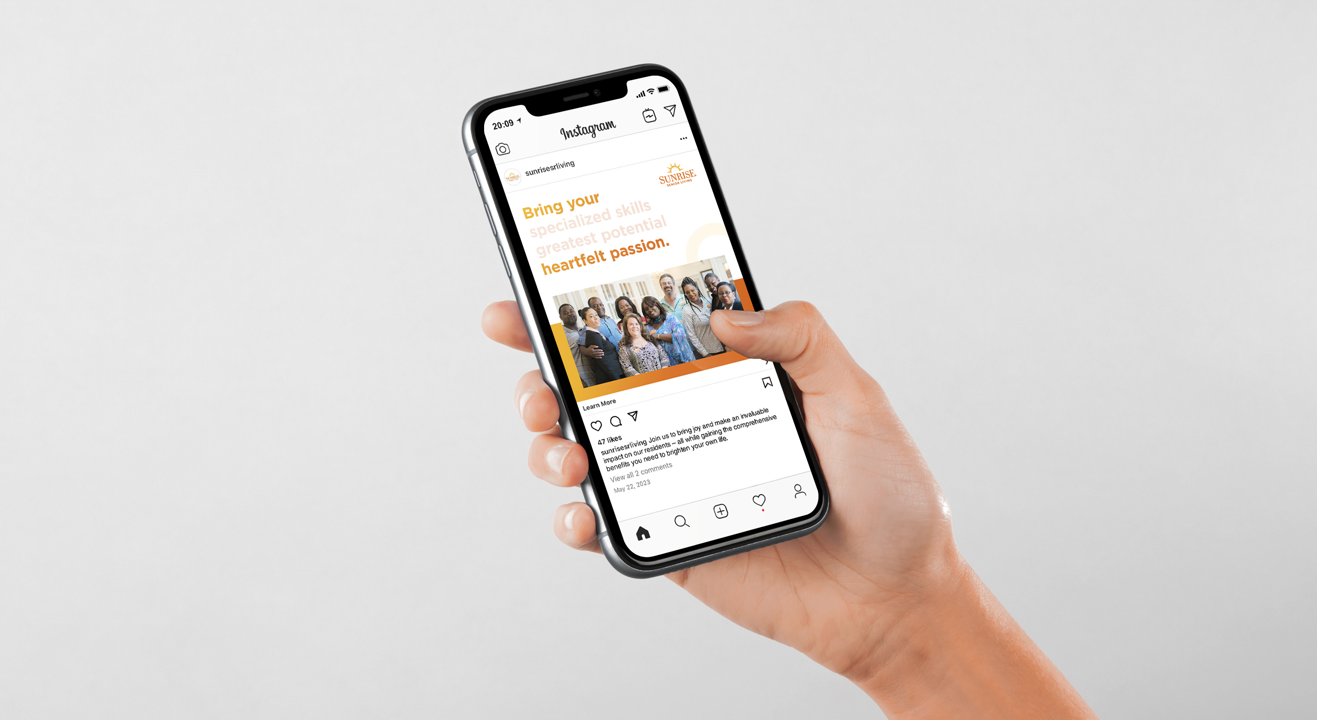
This helped in setting the foundation for our tagline “Rise to the job. Brighten the future.” inviting candidates to envision a fulfilling career that goes beyond a job. It plays on the familiar phrase “Rise to the occasion” with a two-fold meaning, relating to the sun ‘rising’ based on the company name and speaking to the candidates’ brighter futures, made possible by their unique qualities, passions, and goals, at Sunrise.
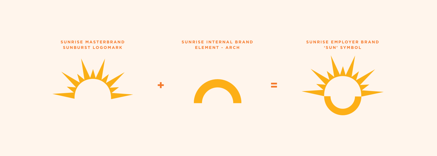
Additionally, I started thinking about what the overarching visual direction might look like, eventually leading to the creation of an important brand element, the ‘sun’ symbol. There were several factors that led to the creation of it:
It acts as both a representation of the company’s internal culture and brand as well as a visual cue for the external employer brand.
Based on the tagline – thinking about how we can visually show these two parts ‘rise to the job’ and ‘brighten the future’ as a holistic whole.
Whole circle that exudes the idea of this reciprocal/mutual relationship between the team members and residents.
In terms of the visual language, I utilized design elements such as gradients, ‘sun rays’, and photography to convey a sense of movement, growth, and warmth. The ‘sun rays’ in this case represent the multifaceted opportunities available to team members, including career advancement, skill development, and a supportive work environment. Overall, I wanted the design to exude the idea of a hopeful and uplifting view of the Sunrise experience.