VISUAL IDENTITY | ART DIRECTION
Little Leaves
Employer Brand Identity
ROLE : ART DIRECTOR
Project Overview
Little Leaves is a center-based Applied Behavior Analysis (ABA) therapy organization for children ages 1-6 with autism spectrum disorder that helps them reduce their symptoms of autism. The goal of this project was to design a unique employer brand concept that clearly conveys the organization’s employer value proposition to draw top-tier talent and support its various therapy centers across the country.
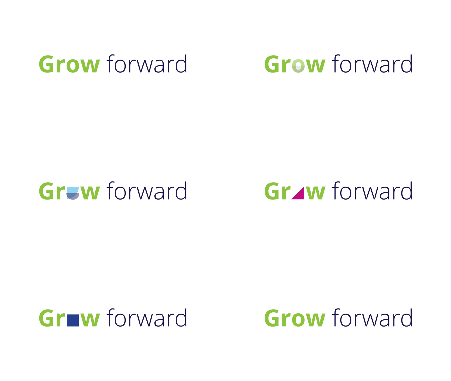
TL;DR | Project Summary
The goal of this project was to showcase the unique culture, benefits, and work environment of Little Leaves, setting it apart from its competitors. The challenge was to develop a concept that aligned with the existing brand while establishing a distinct employer identity that had its own personality.
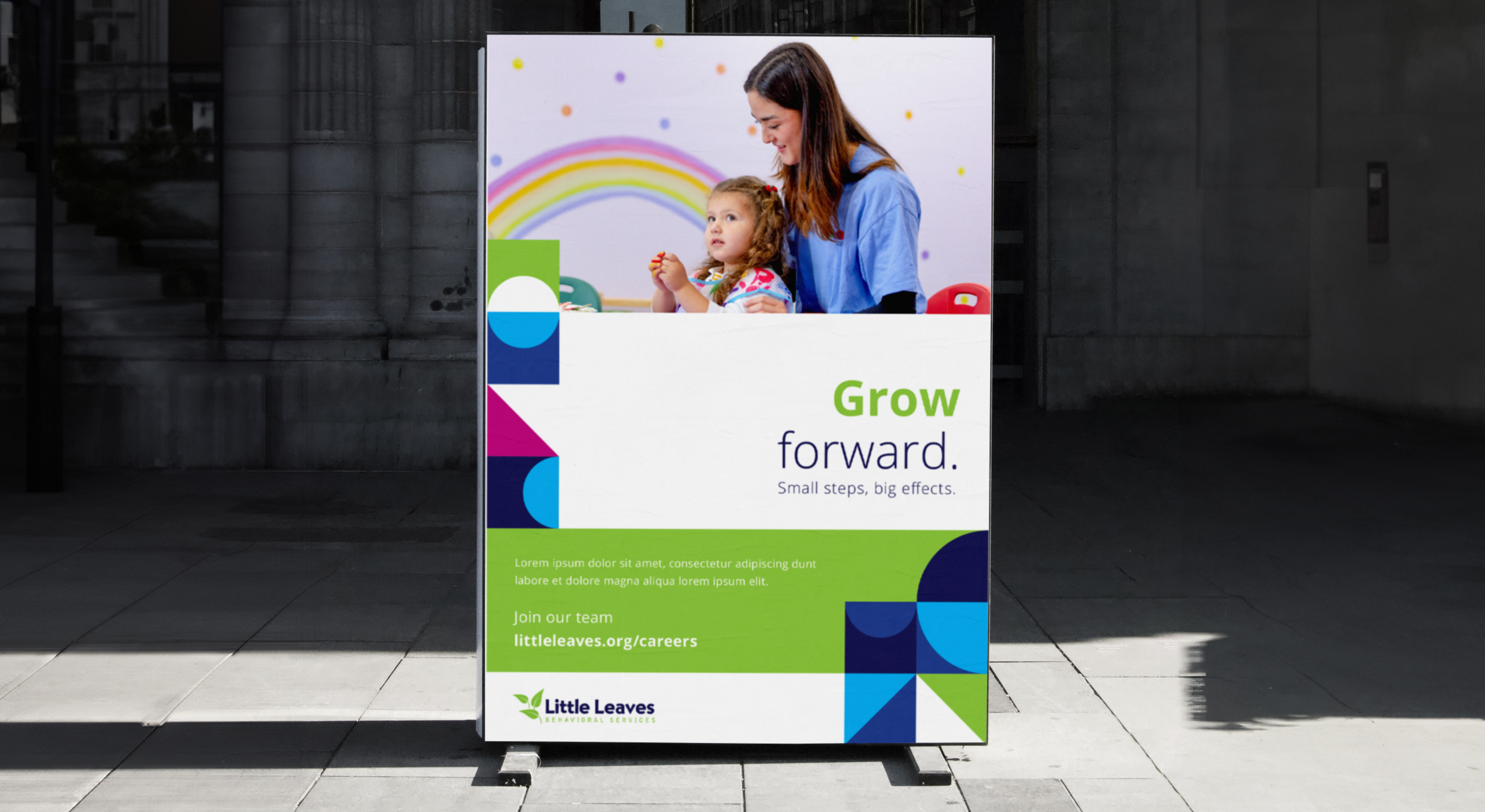
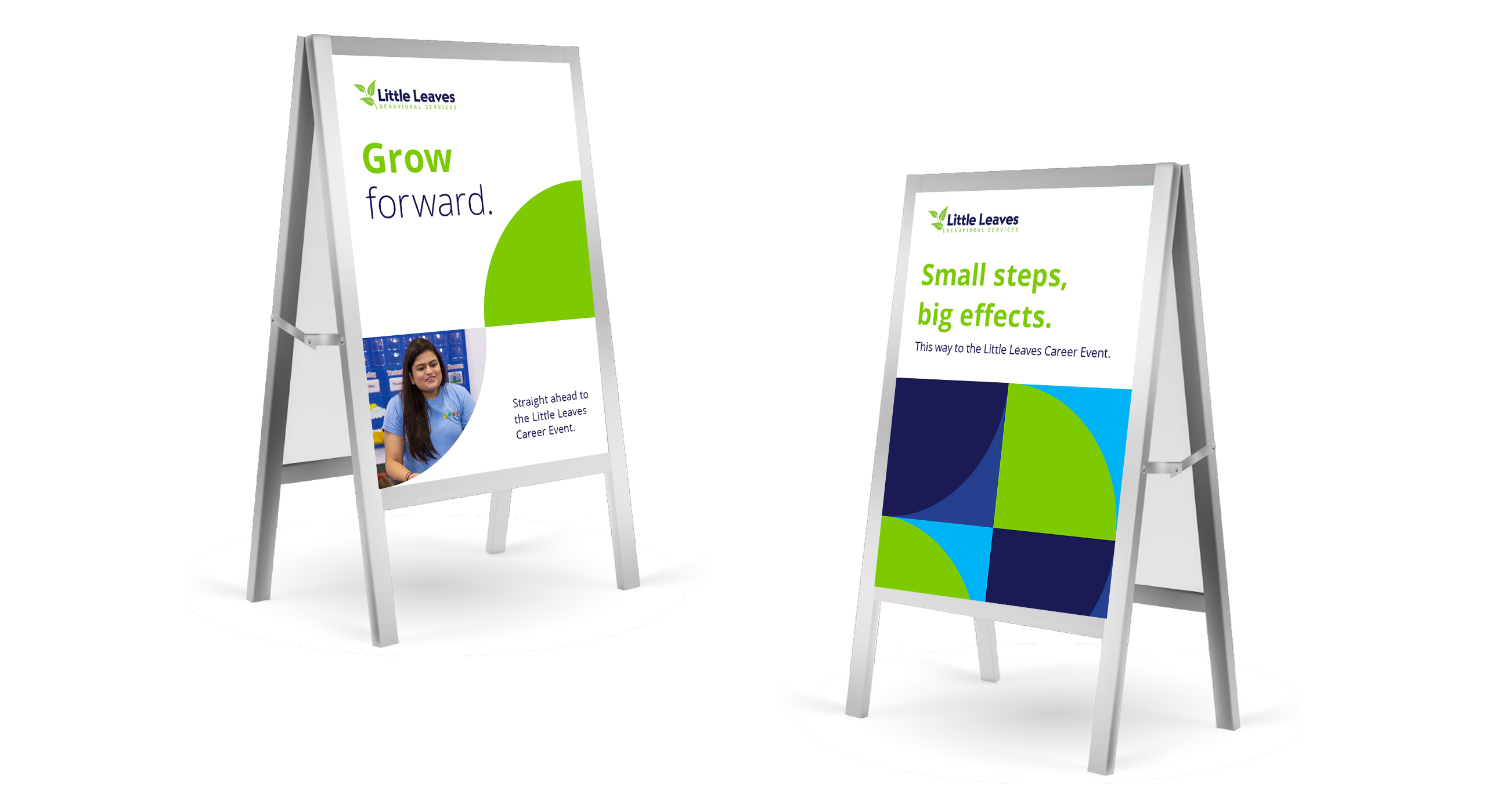
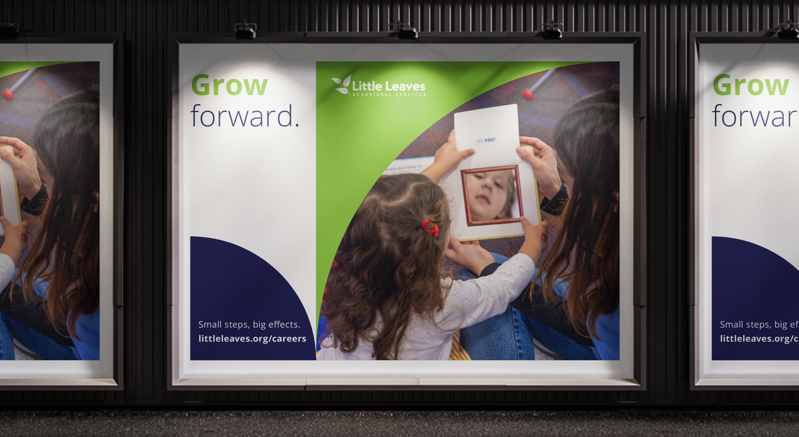
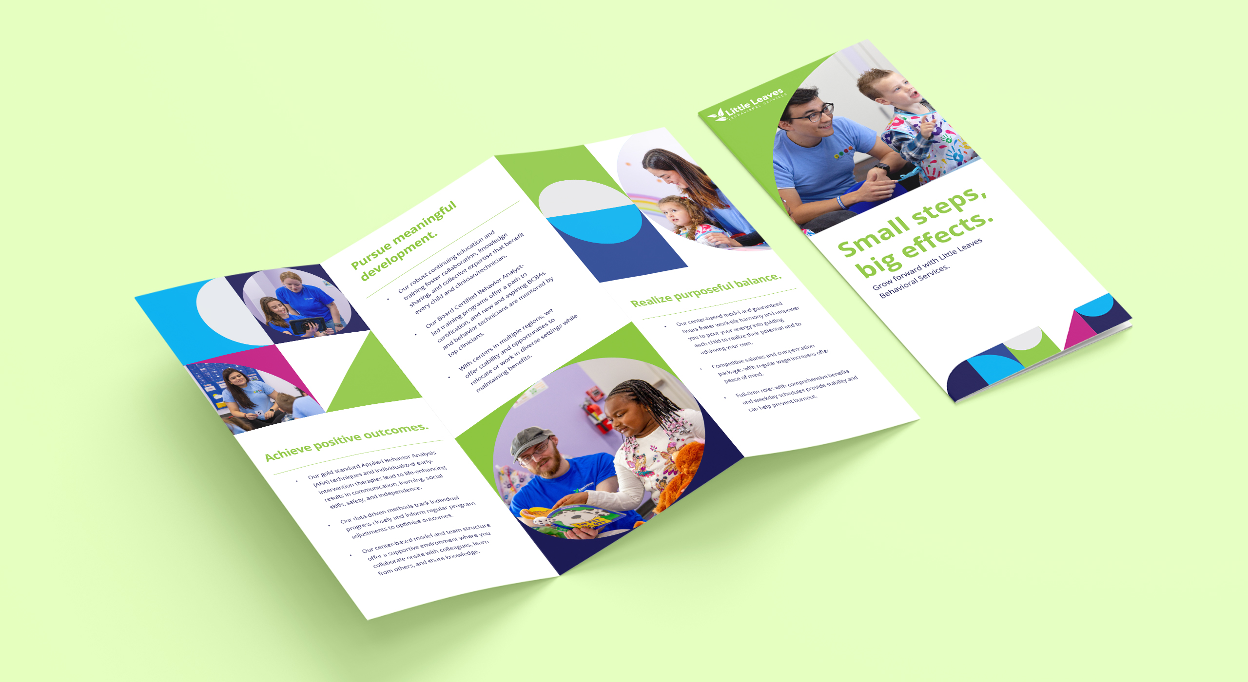
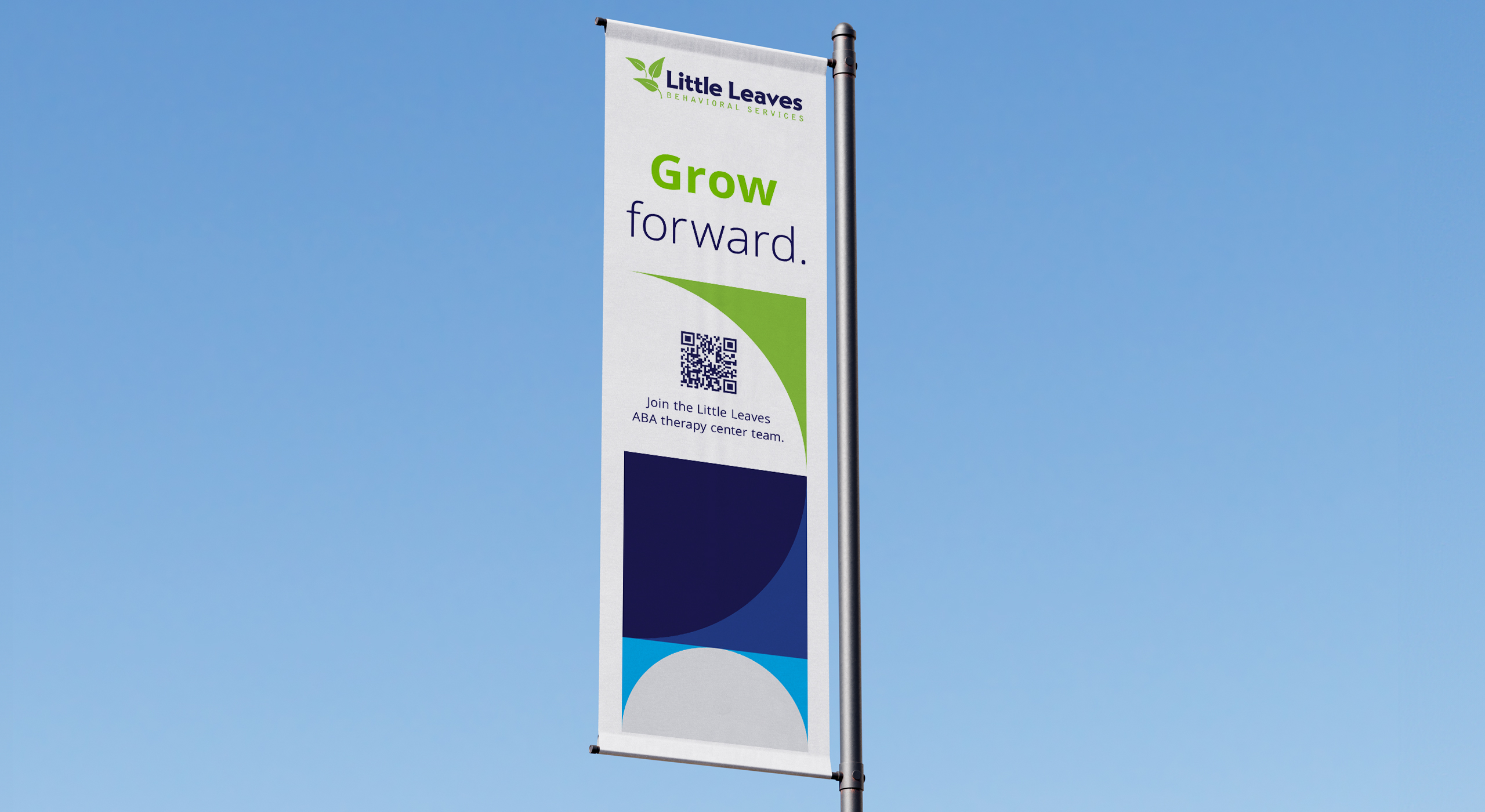
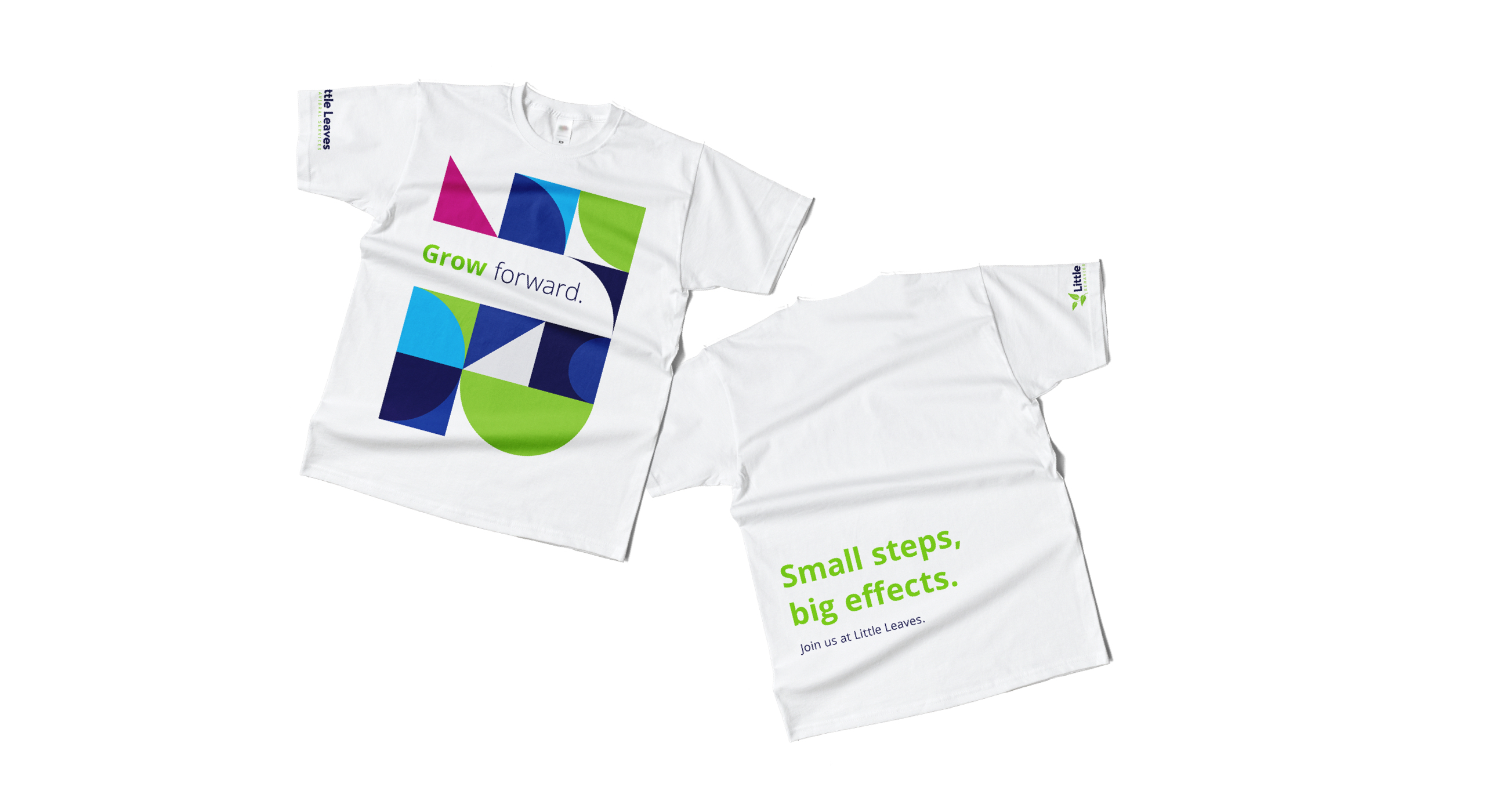
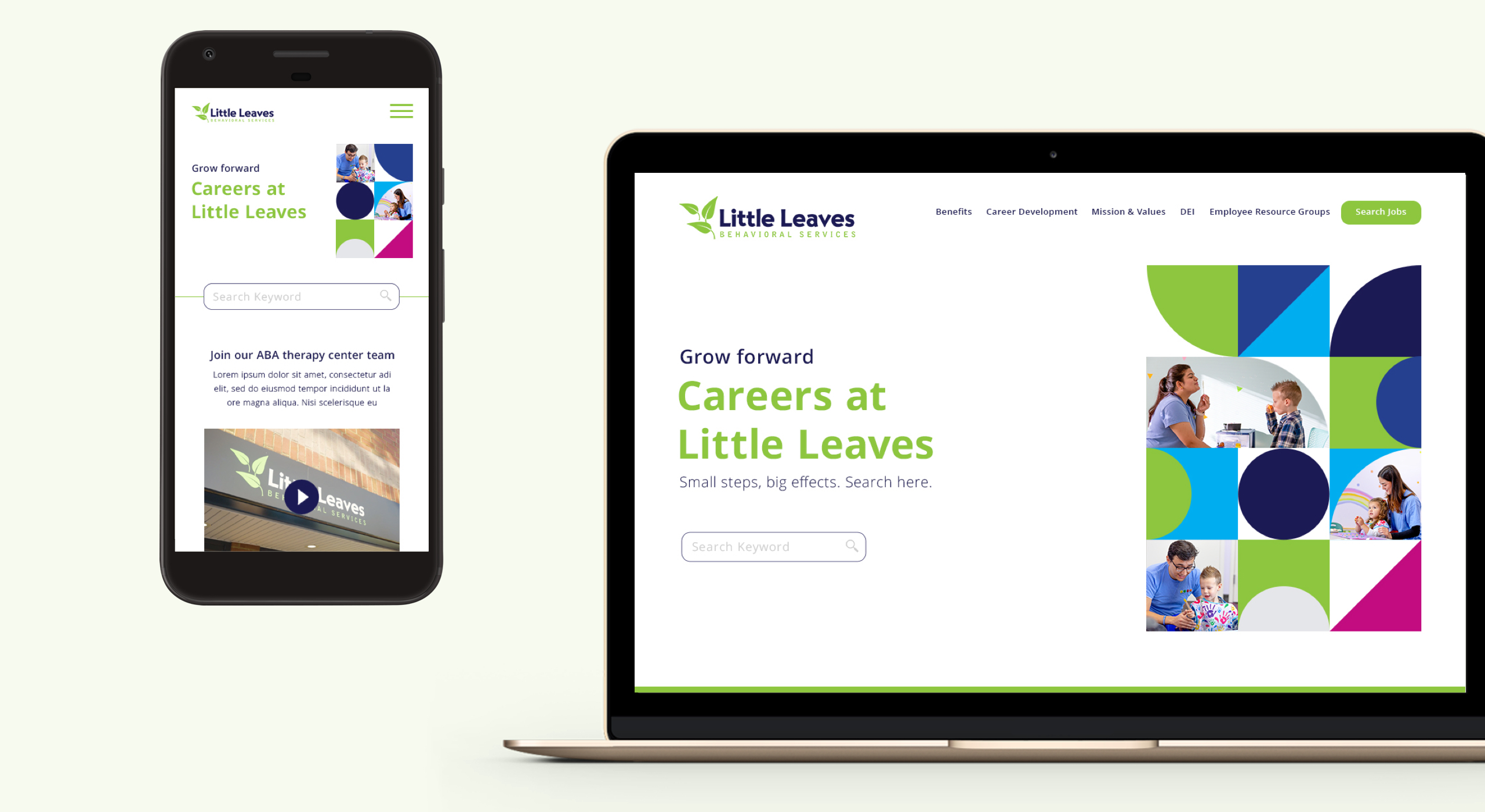
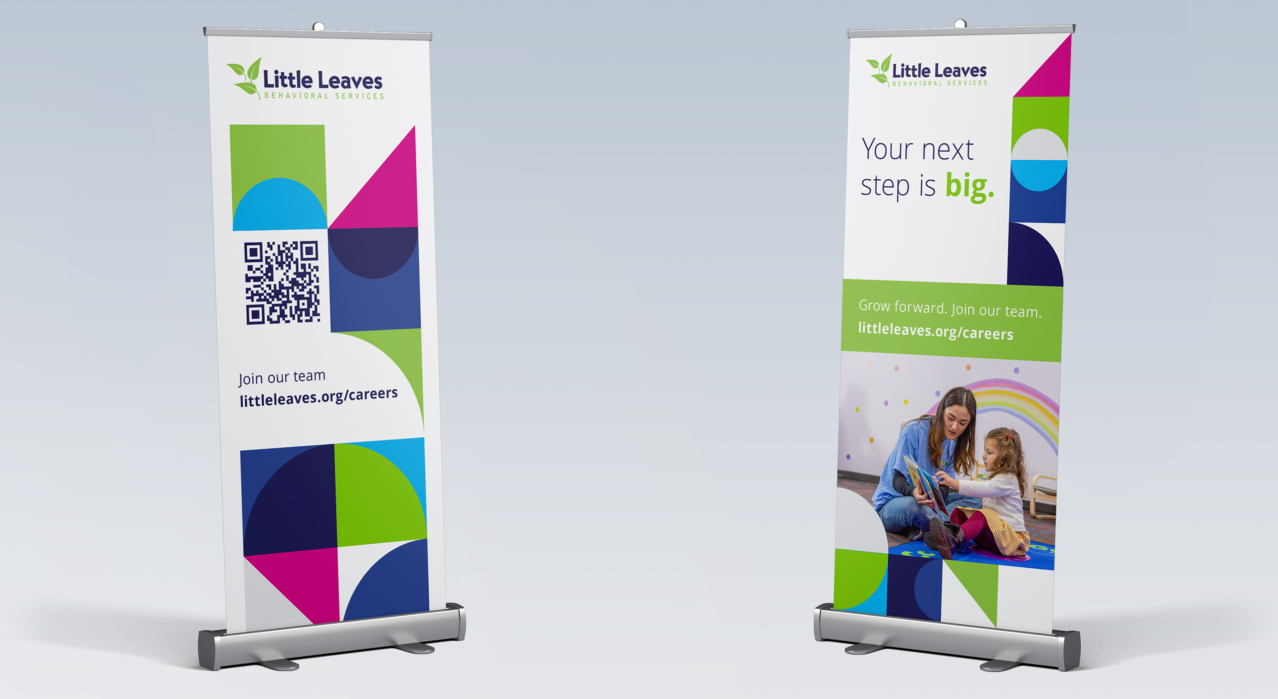
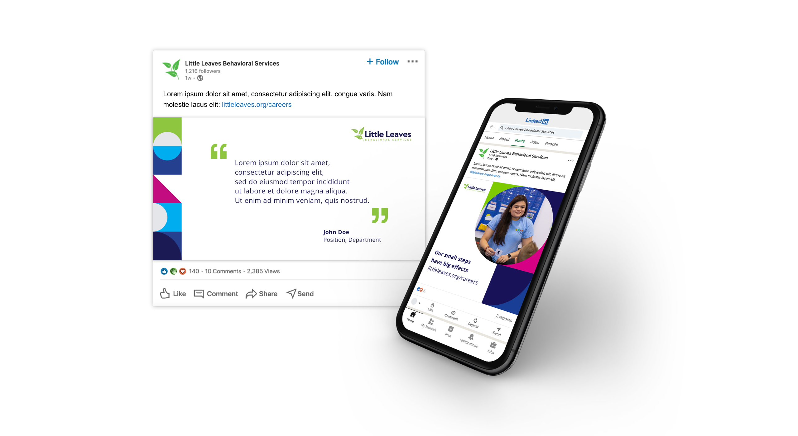
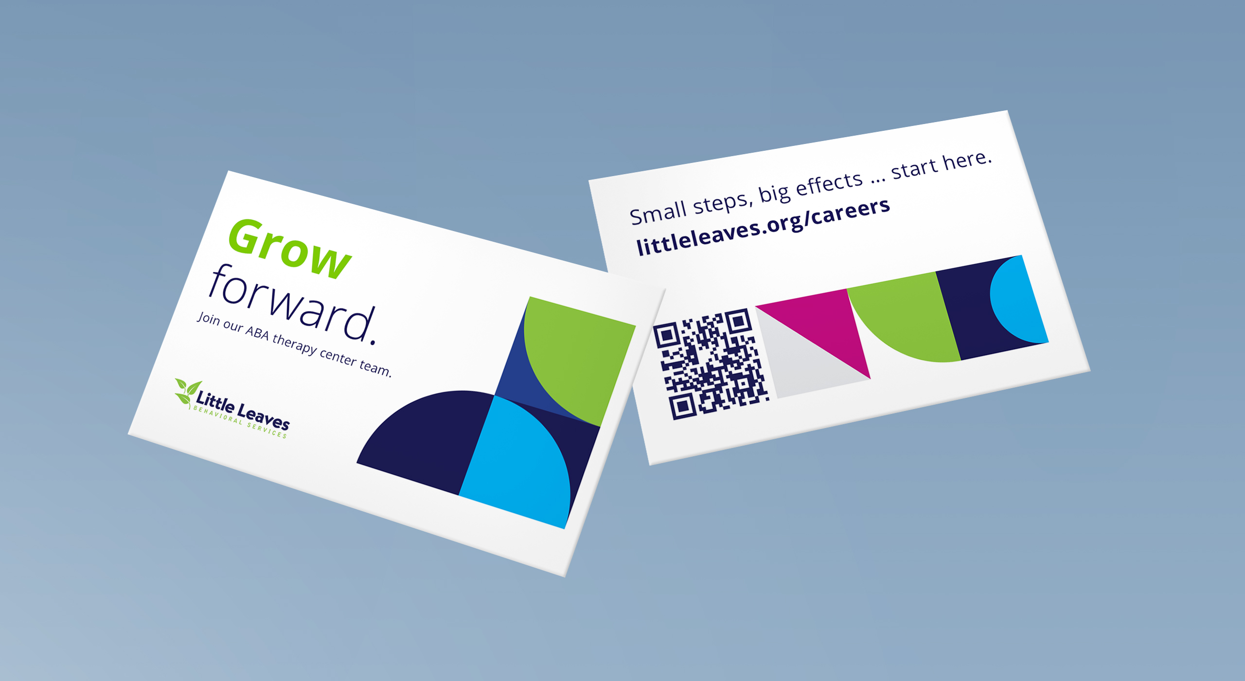
I started by analyzing the creative brief, competitive landscape, the impact of the work within the organization and several other factors to determine the overall design direction. I collaborated with the copywriter on my team to hone in on a direction that felt familiar yet distinctive to the Little Leaves organization. In terms of visuals, I created a design that utilizes colorful, geometric shapes inspired by the centers’ interiors and the therapists’ tools. The stark white backdrop highlights the concept of ‘growth,’ balancing out the vibrant shapes with the negative space. When the final project was presented, the client praised the design concept for effectively capturing the organization’s essence and standing out visually against the crowd.
Part I – Concept
The creative process behind the employer brand concept for Little Leaves began with a thorough analysis of the organization’s mission, values, and competitive landscape. I collaborated closely with my team to understand the unique needs of Little Leaves, primarily focusing on the importance of building a work environment that highlights their empathetic, supportive, and child-focused culture. The challenge was to craft a design that felt both familiar to the existing brand and also distinct in its employer-facing messaging. This meant balancing Little Leaves’ core identity with a fresh and unique approach that would help them stand out in the competitive ABA therapy space.
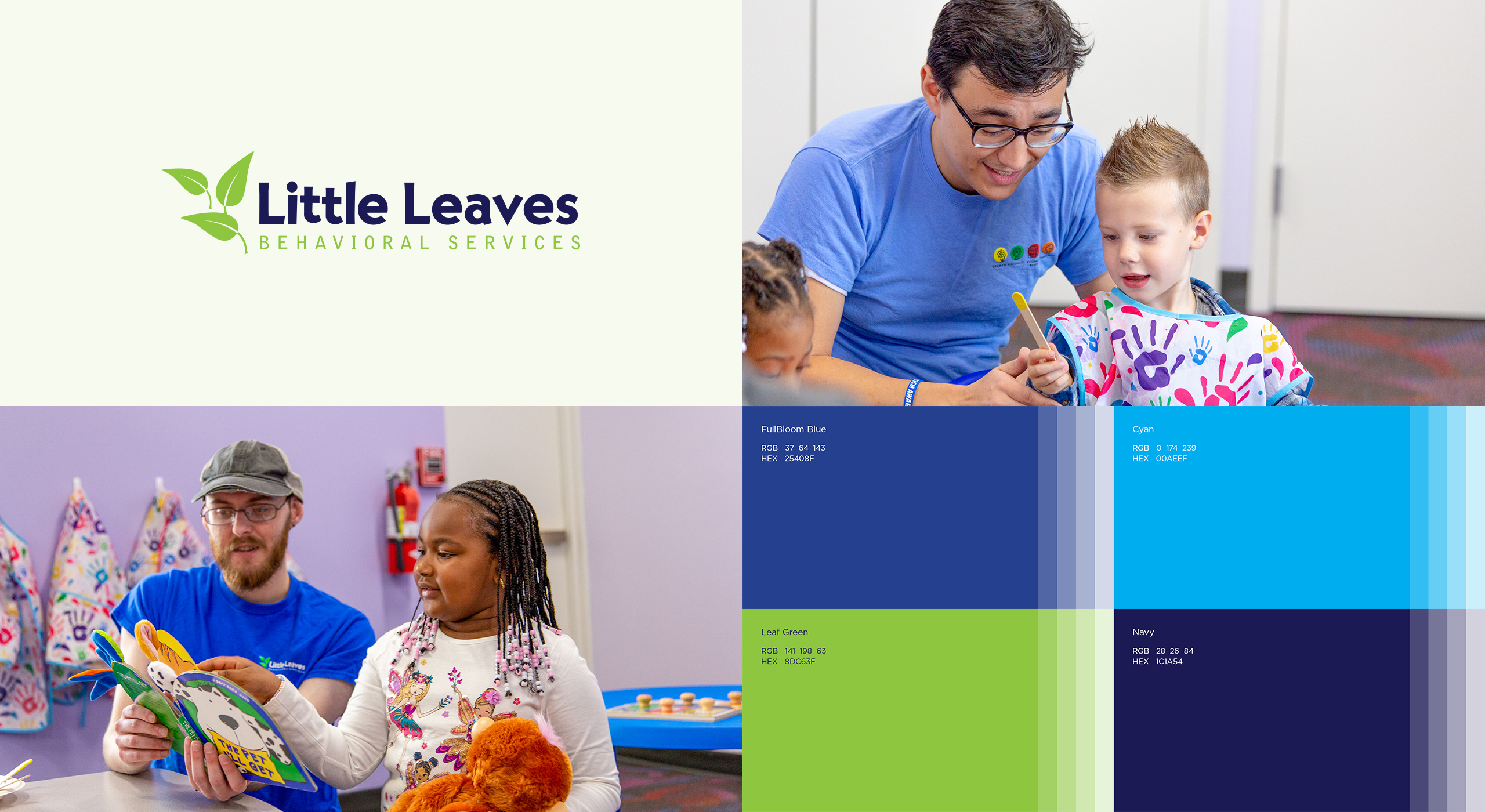
After reviewing the brief and conducting an in-depth analysis, I honed in on a design direction that would capture the essence of growth and development. The geometric block graphics were a key element in this, drawing inspiration from both the playful and structured tools used in therapy and the geometric patterns found within Little Leaves’ centers.

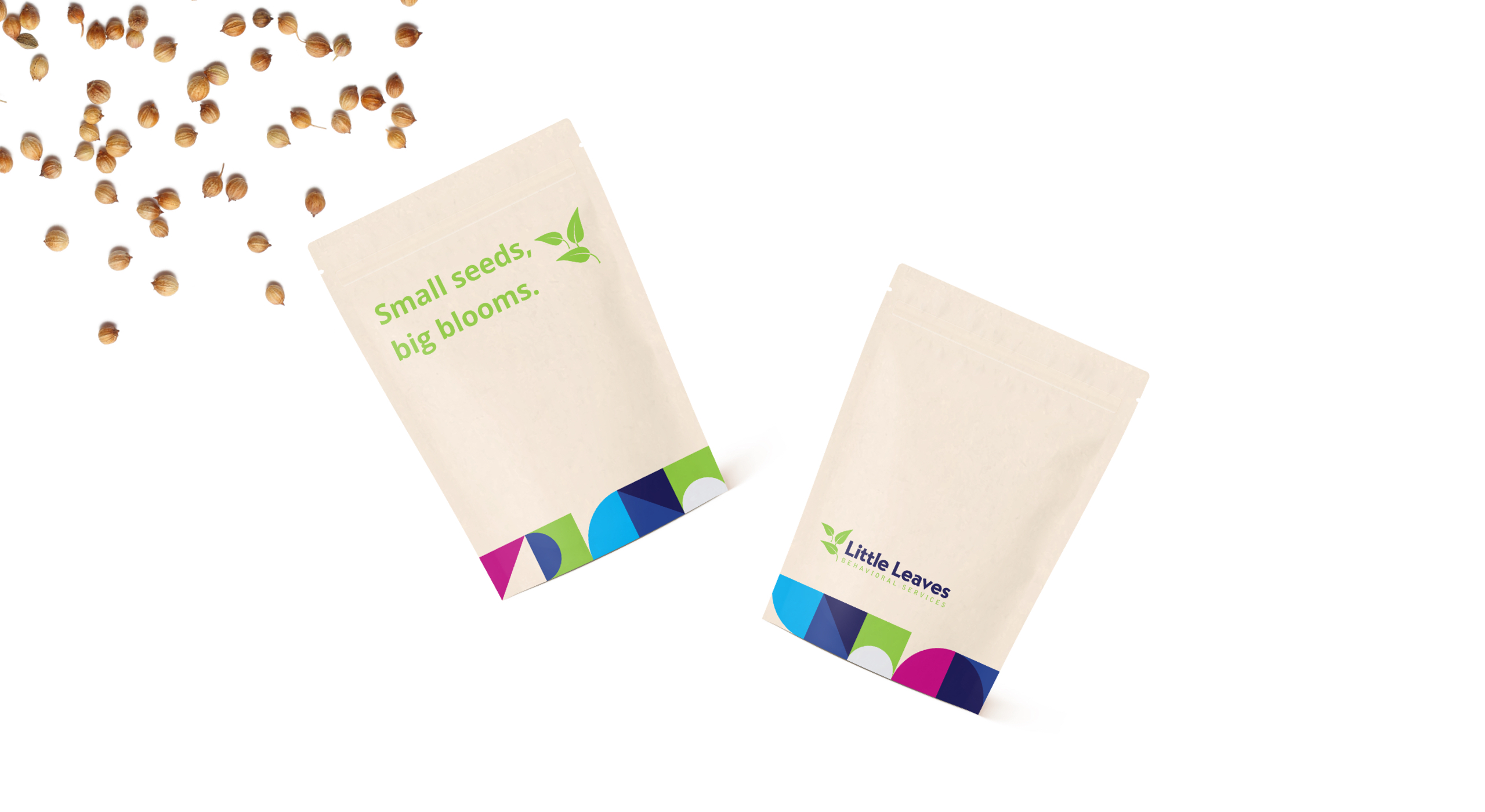
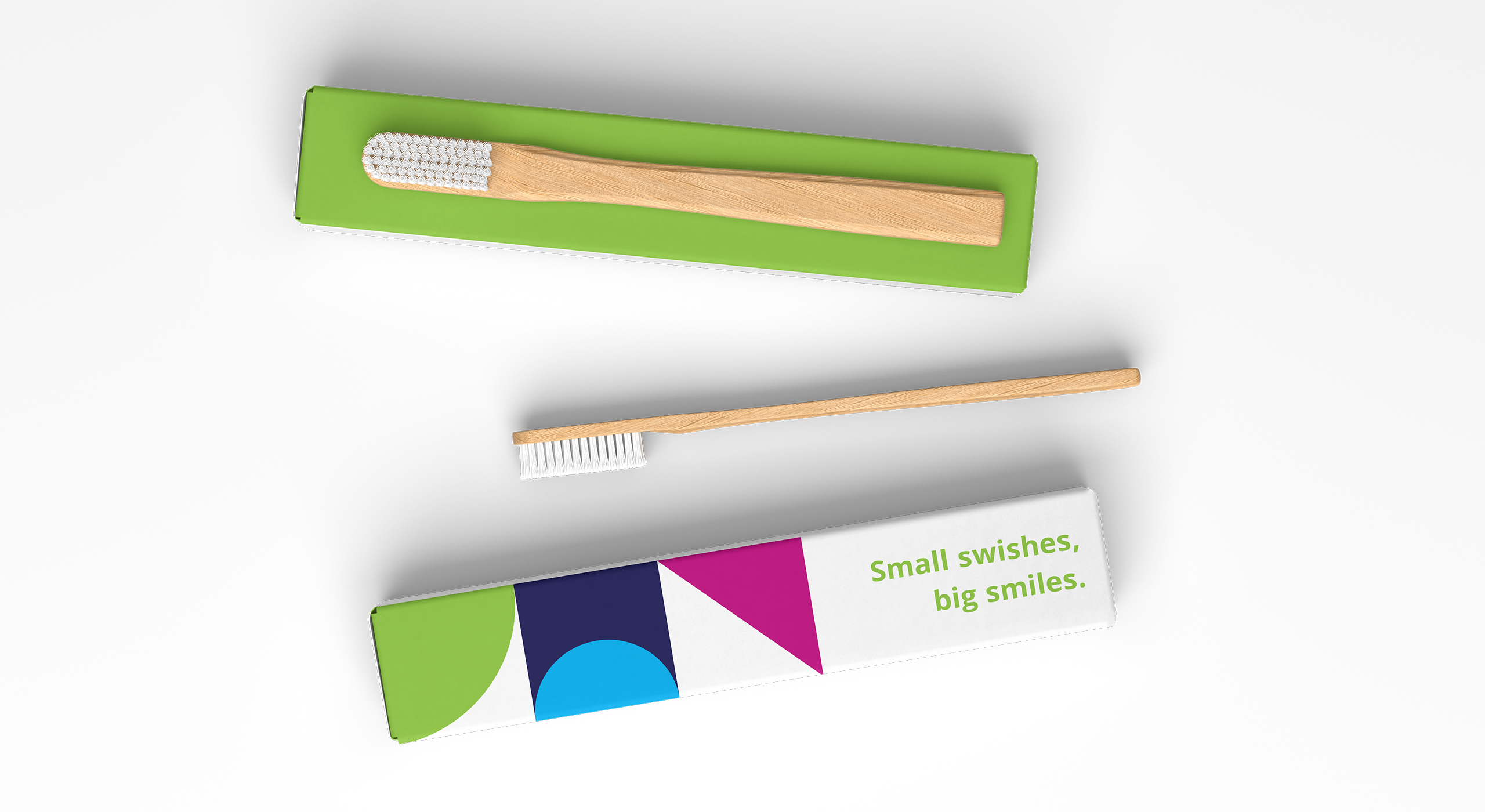
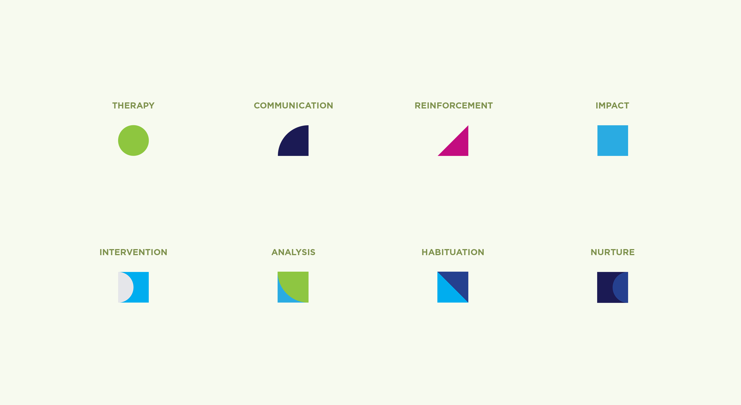
The shapes felt childlike and engaging, while also symbolizing the building blocks of progress in therapy. I wanted to create a design system that was modular, to ensure flexibility for use across the broader FullBloom brand (family of brands), while still remaining true to the personality of Little Leaves. The use of these shapes allows us to tell the Little Leaves’s story through the visuals and conceptually tie it to the brand’s mission.
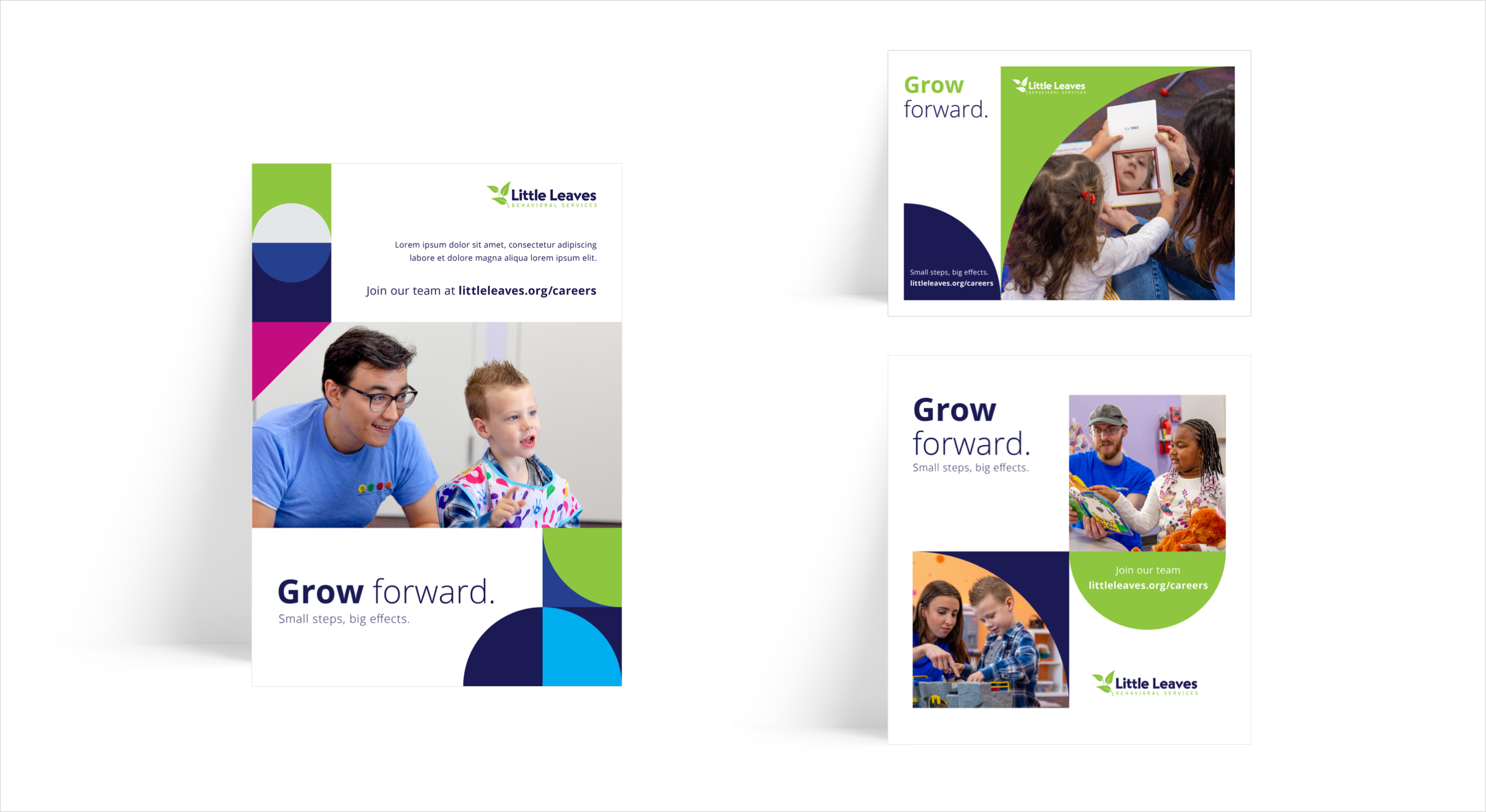
I wanted the backdrop to convey a sense of openness and opportunity that mirrors Little Leaves’ approach to therapy, playing an important role in the design. It also serves as a way to not only differentiate the brand from the more educational-focused divisions of FullBloom, but to reflect a sense of cleanliness and clarity, aligning with the organization’s clinical foundation.
Part II – Activation
