Project Overview
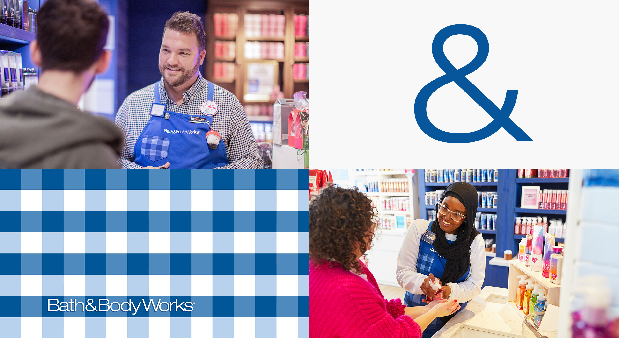
Bath & Body Works, a leading U.S. retailer in personal care and home fragrance, operates over 425 international franchise locations. To streamline its resources for employee growth, development, and well-being, the company launched the “Investing in You” campaign. This internal initiative aims to raise awareness of available resources among employees
and attract potential candidates. The task was to create a unique logo and design concept for the campaign, aligned with Bath & Body Works’ corporate branding.
TL;DR | Project Summary
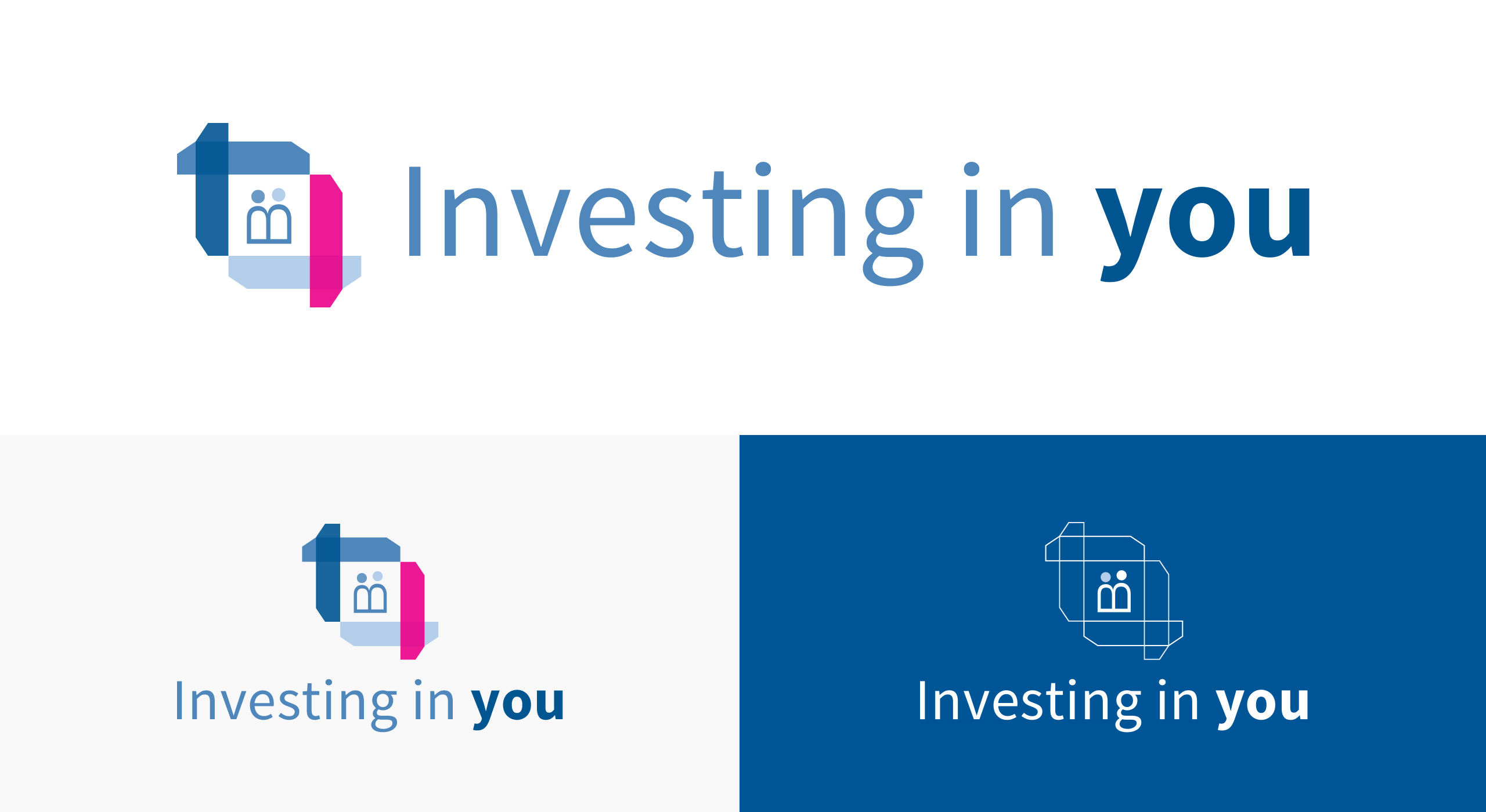
For this project, the aim was to create a logo and concept for Bath & Body Works that felt bright, happy, and
relatable. In collaboration with my creative director, we developed a concept that aligned with the Bath & Body
Works brand while introducing fresh visual elements. The logo incorporates three main components: people (employees),
programs (campaign breadth), and connections (linking people, brand, and programs). The design features the “B” from the
Bath & Body Works wordmark, rotated 90 degrees, and interlocking pillars inspired by the company’s “gingham
pattern.”
Part I – Logo Process
The first part of the project was to design a logo for this campaign. Some of the key parameters I worked with
initially, included the need for it to be eye-catching and closely aligned with the overall purpose and goals of
the campaign. The client also shared that they would like the logo to have its own unique identity, but at the same
time, illustrate a clear connection to Bath & Body Works, reflecting the brand’s values and image.
My approach to this challenge was to draw inspiration from the heart of the Bath & Body Works brand itself.
Given its iconic and recognizable status, I wanted to honor the essence of their renowned logo while seamlessly
integrating it into this new campaign logo.
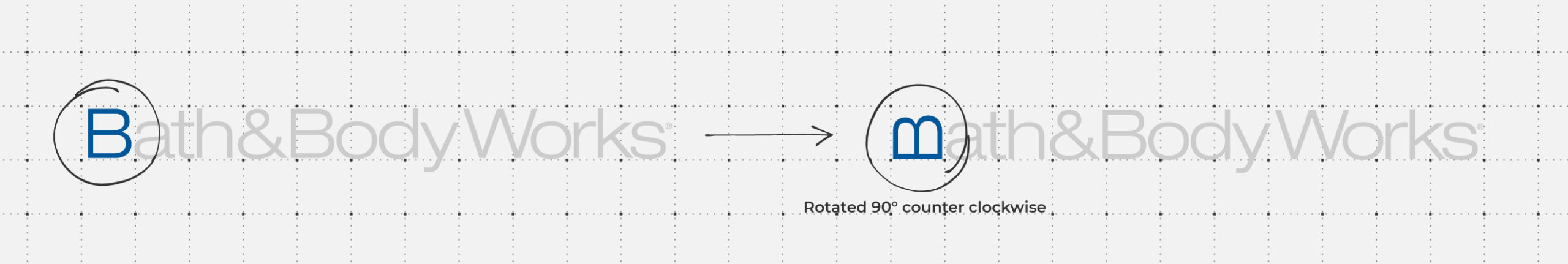
A key element to this logomark that I aimed to highlight were the ‘people’ iconography. The “bodies” of the people
in the center are creatively derived from the “B” in the Bath & Body Works wordmark, rotated 90º to form a
symbolic representation of the brand’s identity.
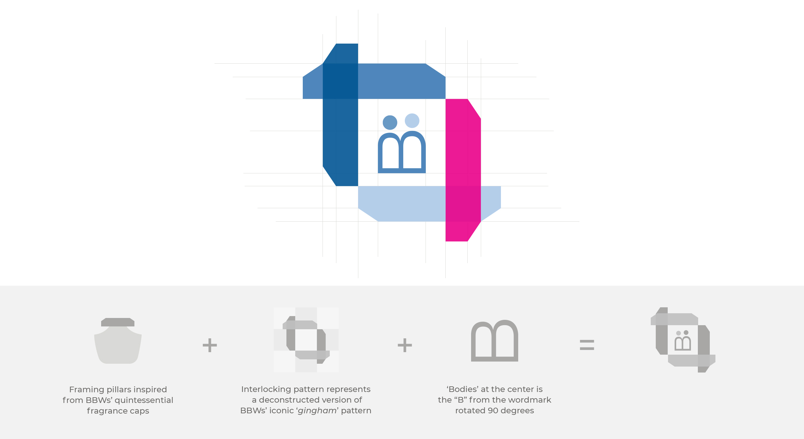
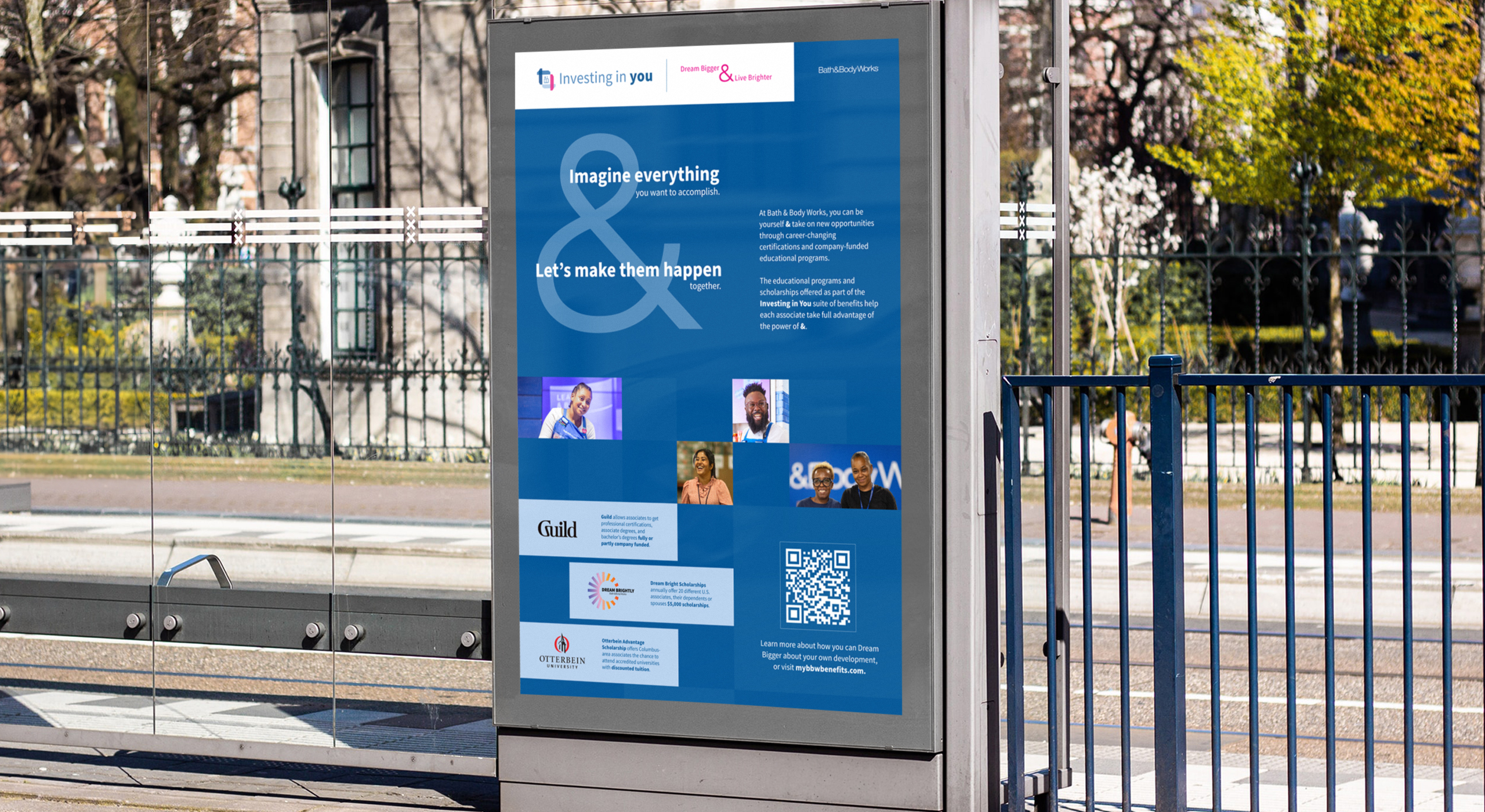
The framing pillars visually represent the broad scope of the “Investing in You” campaign, encompassing multiple
programs that are all interconnected. Additionally, the overlapping pillars also emphasize how each program is
linked to the larger campaign.
Part II – Concept Design Process
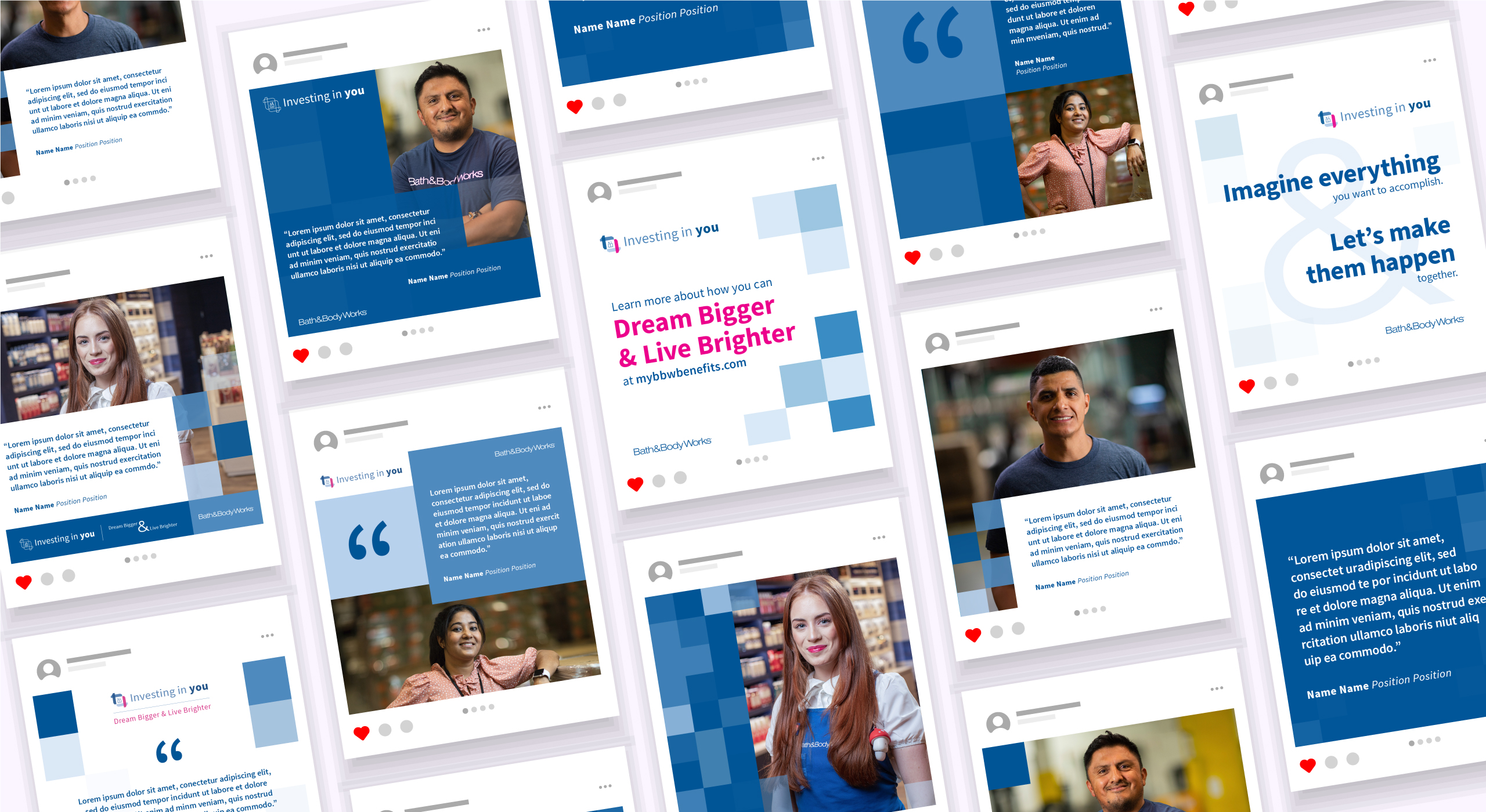
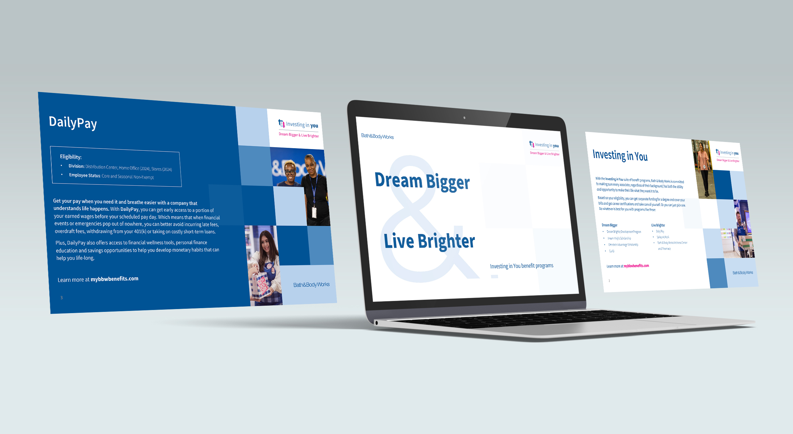
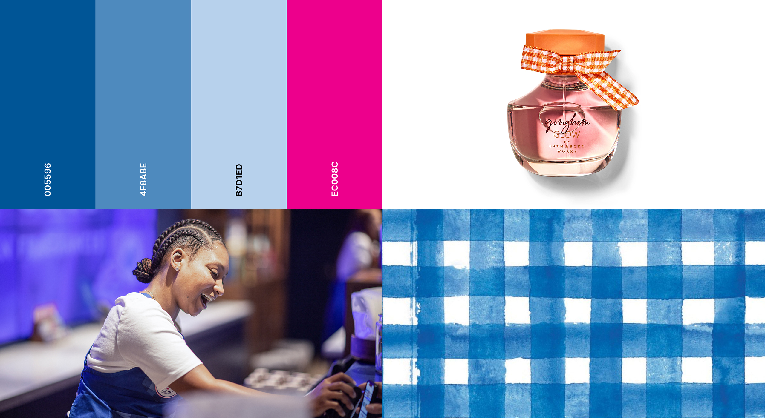
The second part of the project was to design the overall visual concept for this campaign. Some of the key
parameters I worked with included focusing on themes that define the benefits and importance of the “Investing in
You” campaign as well as connecting visually with the positive tone of the Bath & Body Works brand.
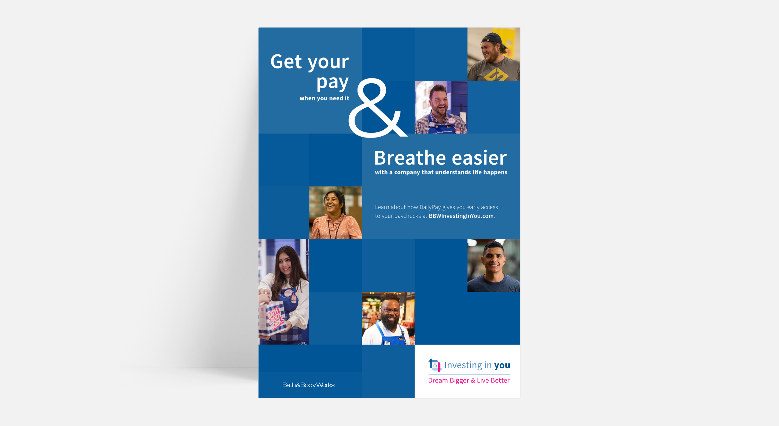
Together with my team, we brainstormed over different overarching themes that aligned to the project’s parameters
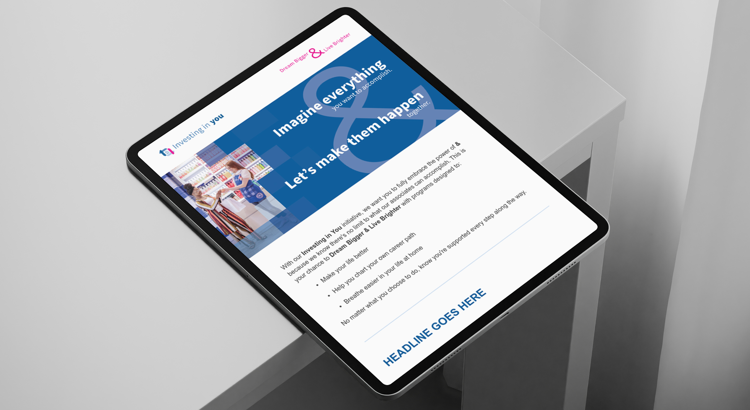
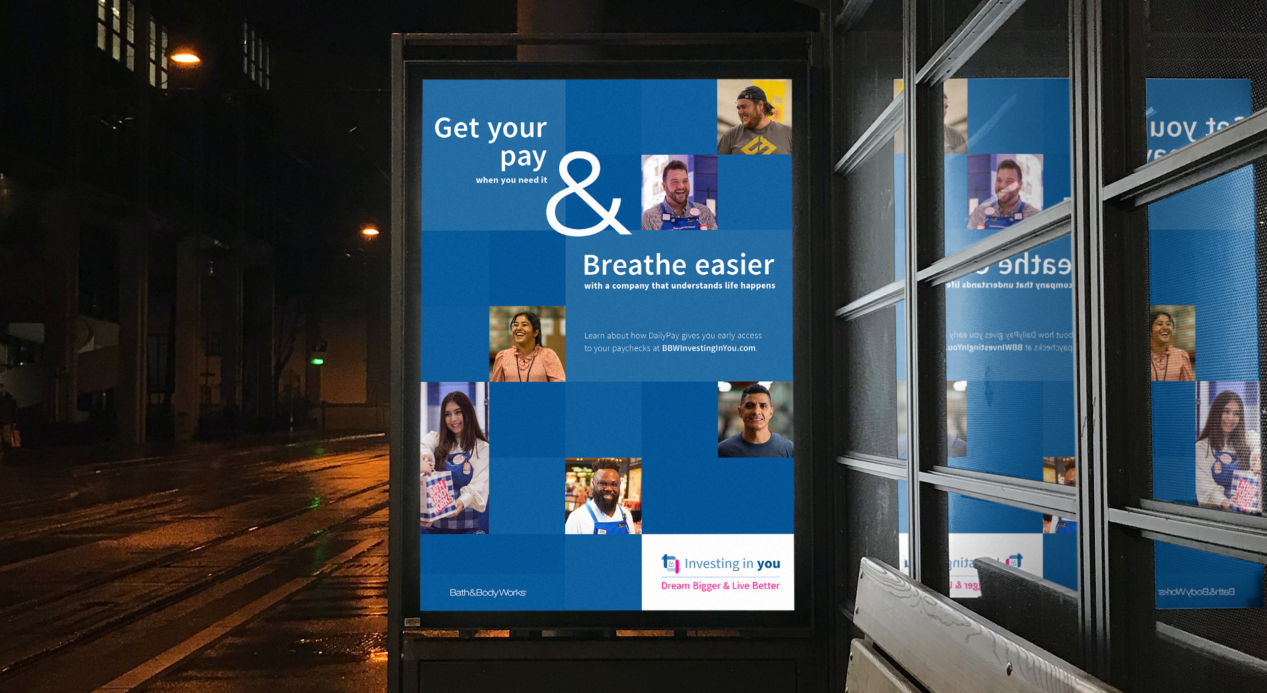
and expressed the campaign’s voice and tone. Ultimately, we landed on a theme titled the ‘Power of AND’ evoking
inspiration from the ampersand.

This modular system allows for flexible storytelling—whether showcasing the company’s broad investment in employees
at all levels or focusing on specific groups. The ampersand in the design is very prominent, drawing the audiences’
eyes to it immediately, showcasing the message loud and clear.
Part III – Activation