UI/UX | VISUAL DESIGN
RSM
Career Search + Campaign Pages
ROLE : LEAD DESIGNER
Project Overview
RSM is an audit, tax, and consulting firm focused on the middle market in the United States and Canada and is ranked as the 7th most prestigious accounting firm in the US. For this project, I was tasked to create their career site search, job description and campaign pages to increase their visibility as an employer of choice as well as to appeal to top quality candidates for general and specialized positions.
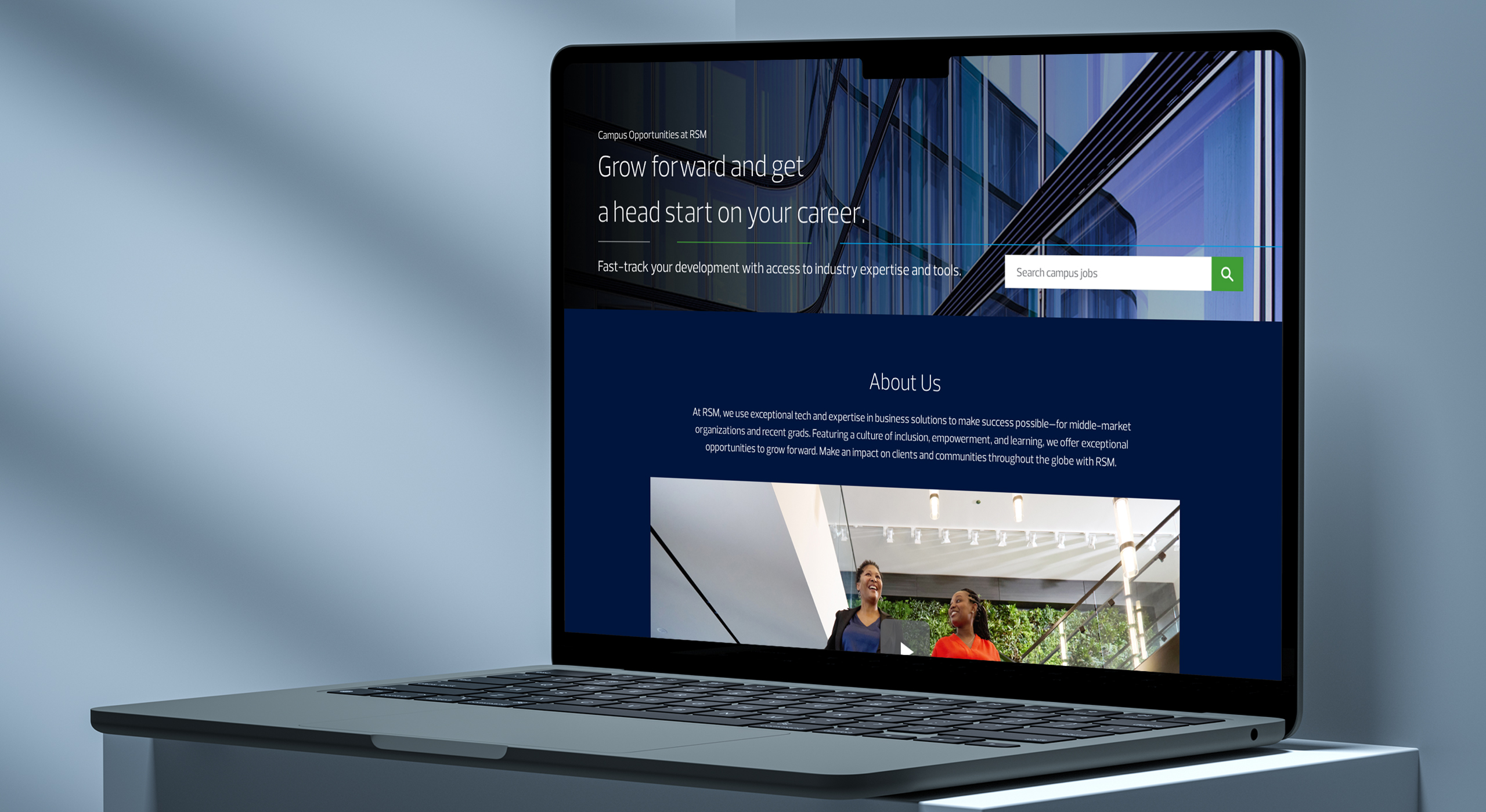
TL;DR | Project Summary
I began the project by analyzing the client’s existing corporate site, including its structure, user paths, and overall style and composition, using that as a basis for the creation of these new pages. I then identified key objectives and goals for these pages to ensure alignment with target users and overall business goals. One of the challenges for this project was figuring out the best method to integrate them seamlessly within the holistic corporate website while reflecting a fresh look and feel using the company’s current branding.
With the aforementioned parameters in mind, I developed several low-fidelity wireframes and worked closely with the client to determine the overall content, visual direction and framework. The result were pages that offer a balance between the corporate visuals of the brand and the humanistic aspect of RSM’s culture. The client was very pleased with the outcome and felt that these new pages were truly reflective of the spirit and core of the company.
Part I – Site Map + Wireframes
I started the project by doing my research into the company and the brand, identifying key objectives and goals for these new pages. I also started analyzing the current website’s strengths and opportunities, to ensure a seamless integration of these new pages within the holistic website. Once I had a good amount of foundational information, I worked with the client to identify some main themes that we would want these new pages to reflect and this included: ‘attracting top talent’, ‘alignment with the corporate website’, and ‘brand consistency’.
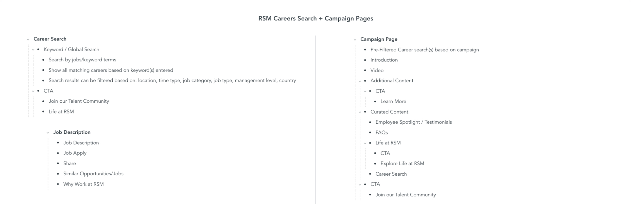
The next step of the process was creating the site map. I started by laying out all the content ideas for these pages and evaluating each idea from the perspective of the user. I then bucketed them into main categories and subcategories, adding structure and hierarchy to the site content.
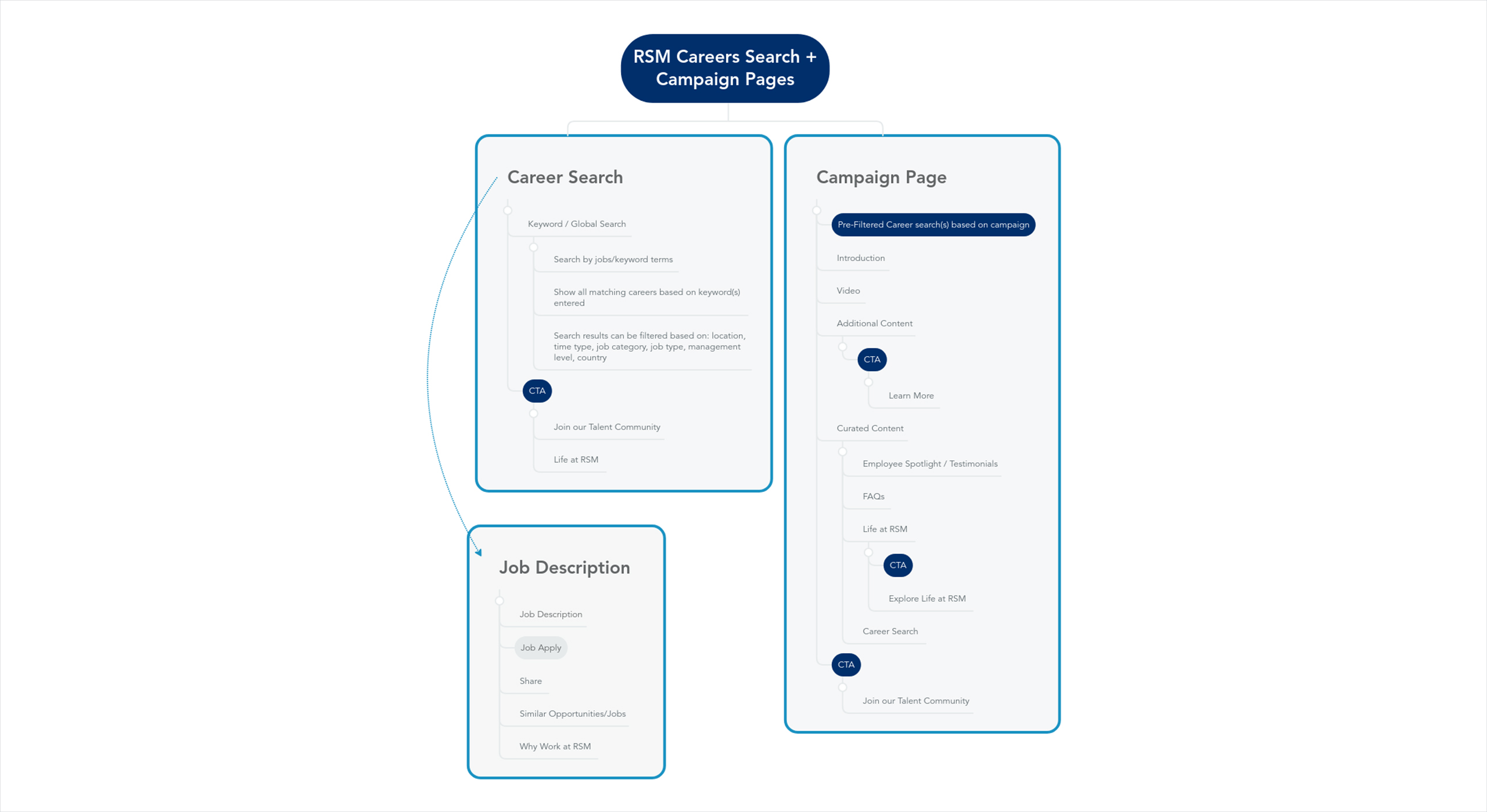
Utilizing the user profiles I’ve created, I refined my site map some more through user journeys, as well as double-checking that every piece of information was consistent and relevant. Once I finalized the content of my site map, I displayed it visually within a tree structure to get a bird’s eye view of how everything fits together.
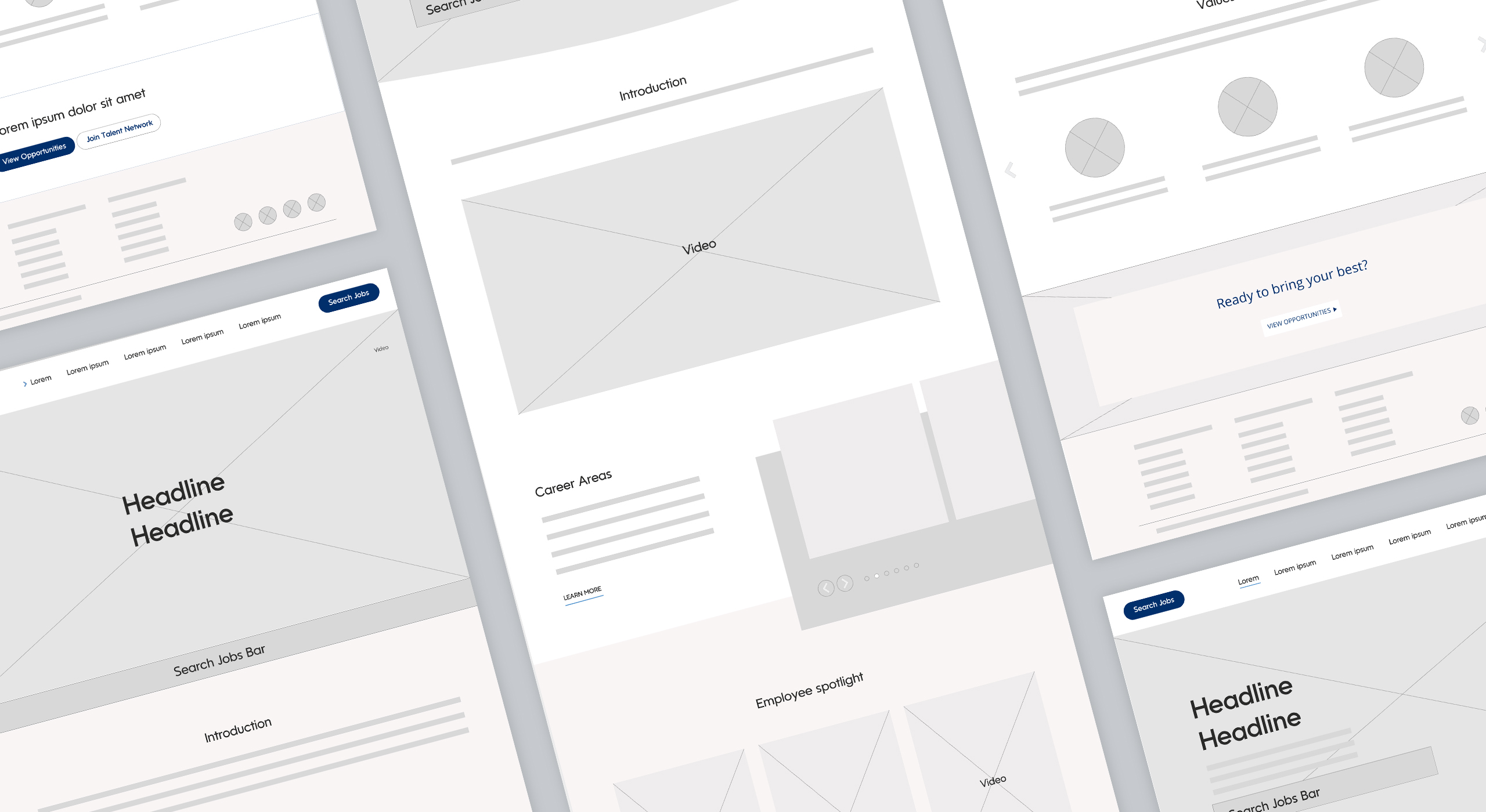
Next, I started sketching the basic layout of the pages with a pen and paper. I created about a dozen possible iterations for each page and filtered them out to reach the final layouts, using the site map as the basis for my content. I then took my wireframes from pen and paper to the digital space, refining them a bit more and ensuring that usability and functionality is top of mind. I shared my lo-fi wireframes with my team who provided valuable insight and feedback which I integrated and has allowed me to perfect the final versions of my wireframes.
Part II – Design
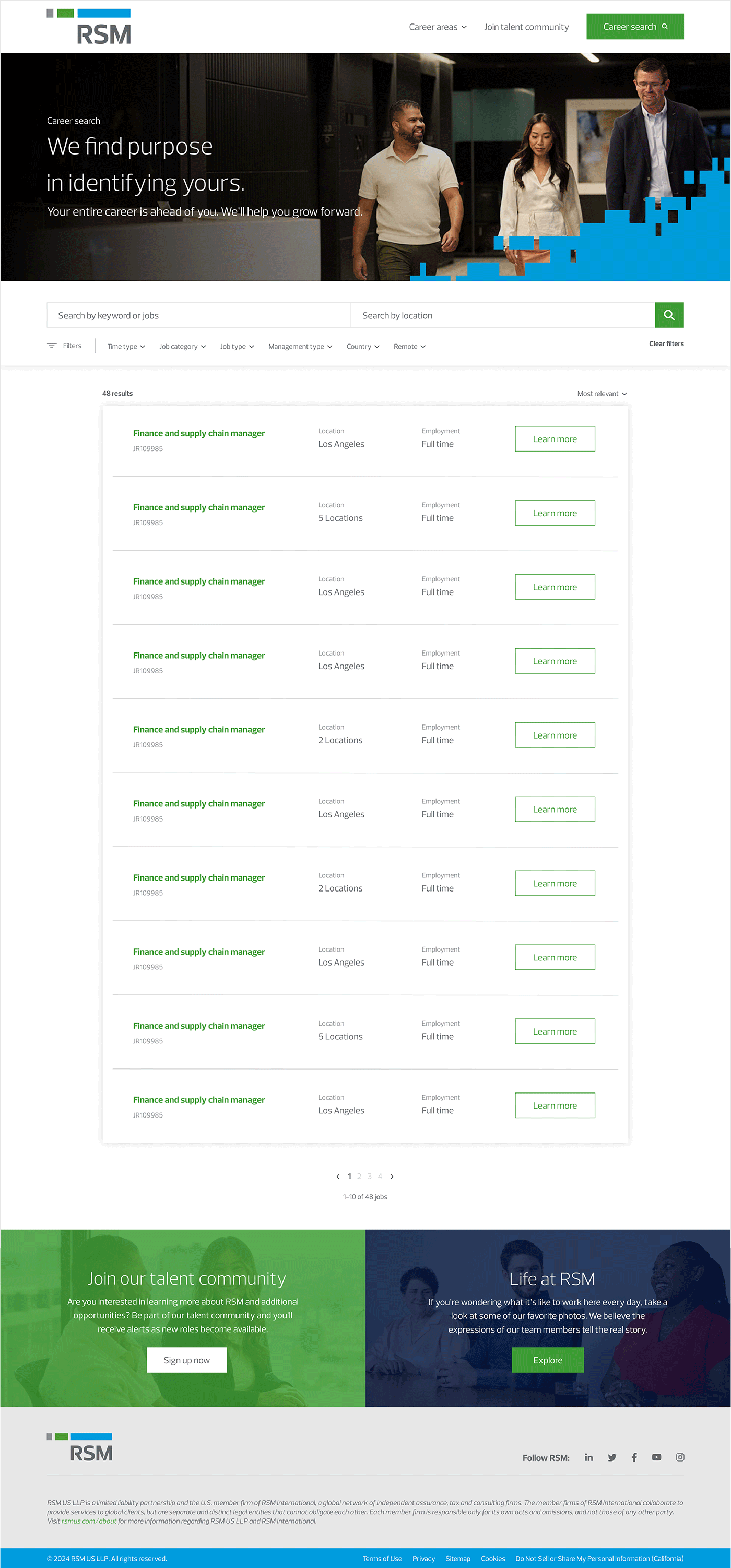
The fun part! Diving into the design of these pages, I wanted to ensure that they were visually uniform compared to the pages on the current website but still differentiated enough to display the brand visuals in a fresh and novel way. In order to bring that sense of familiarity, I utilized elements such as the brand colors, the brand graphic pattern and employee photography. I still wanted to add that sense of differentiation as well so I created new design elements such as the lines in the hero section that were inspired by the RSM brandmark. Overall, I wanted the page layouts to have a clean feel, guiding the candidates through a straightforward path.
Campaign Page

Search Page
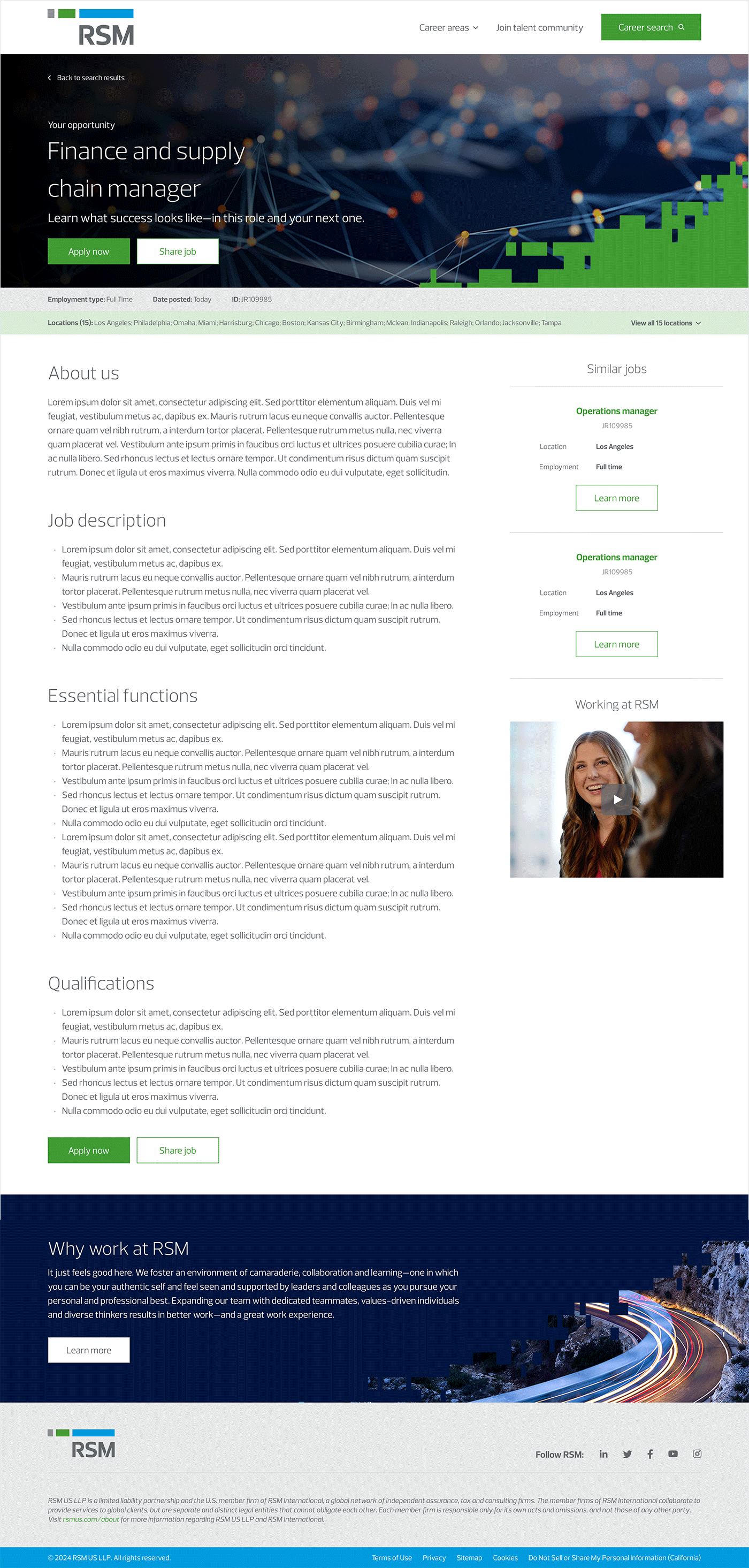
Job Description Page
